
Another mixed effects model visualization
Last week, I presented an analysis on the longitudinal development of intelligibility in children with cerebral palsy—that is, how well do strangers understand these children’s speech from 2 to 8 years old. My analysis used a Bayesian nonlinear mixed effects beta regression model. If some models are livestock and some are pets, this model is my dearest pet. I first started developing it a year ago, and it took weeks of learning and problem-solving to get the first version working correctly. I was excited to present results from it.
But here’s the thing. I couldn’t just formally describe my model. Not for this audience. My talk was at the annual conference of the American Speech-Language-Hearing Association: The main professional gathering for speech-language pathologists, audiologists, and researchers in communication sciences and disorders. The audience here is rightly more concerned with clinical or research matters than the nuts and bolts of my model.
Still, I wanted to convey the main ideas behind the model without dumbing things down. I got to work making lots of educational diagrams. Among them was the annotated logistic curve from my earlier post and the following figure, used to illustrate information borrowing (or partial pooling) in mixed effects models:
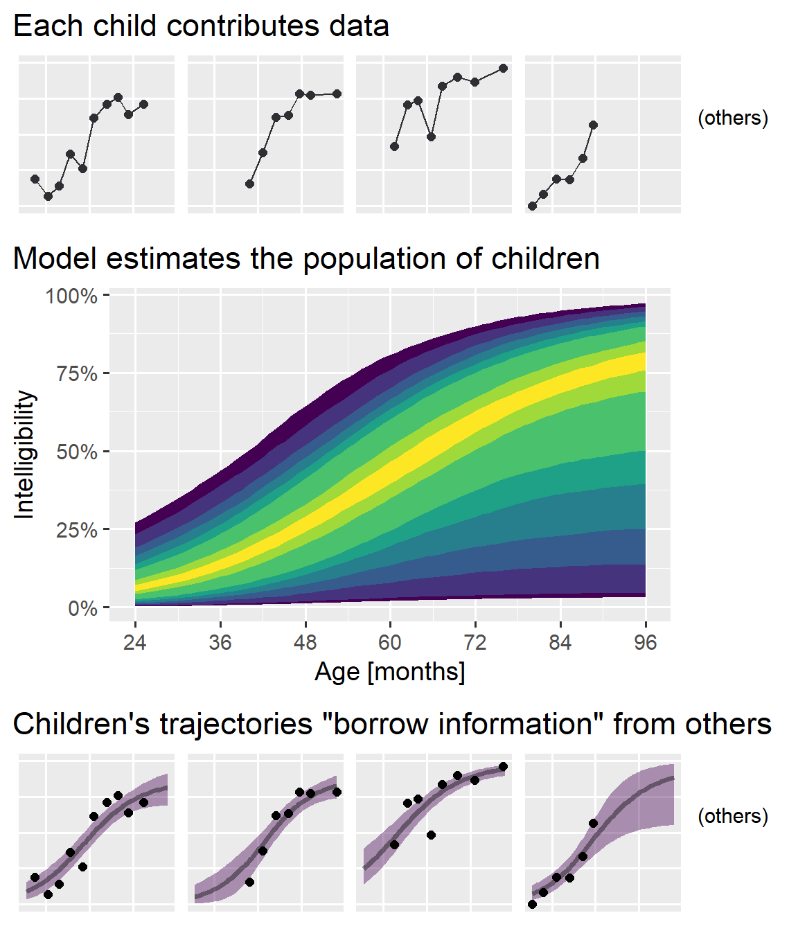
I am pleased with this figure. Originally, I tried to convey the idea as an interactive process: Individual-level data feed into the population model and those feed back into the individual estimates. I had only two sets of plots with labeled paths running back and forth between them; it wasn’t pretty. The final plot’s “feed-forward” approach simplified things a great deal. My only concern, in hindsight, is that I should have oriented things to run left-to-right instead of top-to-bottom so I could have filled a 16:9 widescreen slide better. (But this vertical version probably looks great on your phone or tablet right now, so whatever!)
In this post, I walk through how to produce a plot like this one from
scratch. I can’t share the original model or the clinical data here, so
I will use the sleepstudy data from lme4, as in my partial pooling
tutorial.
First, let’s set up our data.
library(tidyverse)
library(brms)
library(tidybayes)
library(cowplot)

# Convert to tibble for better printing. Convert factors to strings
sleepstudy <- lme4::sleepstudy %>%
  as_tibble() %>%
  mutate(Subject = as.character(Subject))

# Add two fake participants, as in the earlier partial pooling post
df_sleep <- bind_rows(
  sleepstudy,
  tibble(Reaction = c(286, 288), Days = 0:1, Subject = "374"),
  tibble(Reaction = 245, Days = 0, Subject = "373")
)

df_sleep
#> # A tibble: 183 × 3
#>    Reaction  Days Subject
#>       <dbl> <dbl> <chr>
#>  1     250.     0 308
#>  2     259.     1 308
#>  3     251.     2 308
#>  4     321.     3 308
#>  5     357.     4 308
#>  6     415.     5 308
#>  7     382.     6 308
#>  8     290.     7 308
#>  9     431.     8 308
#> 10     466.     9 308
#> # … with 173 more rows

# Select four participants to highlight
df_demo <- df_sleep %>%
  filter(Subject %in% c("335", "333", "350", "374"))
We fit a mixed model with default priors and a random-number seed for reproducibility.
b <- brm(
  Reaction ~ Days + (Days | Subject),
  data = df_sleep,
  seed = 20191125
)
b
#>  Family: gaussian
#>   Links: mu = identity; sigma = identity
#> Formula: Reaction ~ Days + (Days | Subject)
#>    Data: df_sleep (Number of observations: 183)
#>   Draws: 4 chains, each with iter = 2000; warmup = 1000; thin = 1;
#>          total post-warmup draws = 4000
#>
#> Group-Level Effects:
#> ~Subject (Number of levels: 20)
#>                     Estimate Est.Error l-95% CI u-95% CI Rhat Bulk_ESS Tail_ESS
#> sd(Intercept)          25.84      6.26    15.17    39.80 1.00     1822     2642
#> sd(Days)                6.55      1.50     4.19     9.99 1.00     1607     1965
#> cor(Intercept,Days)     0.09      0.29    -0.45     0.66 1.00      904     1618
#>
#> Population-Level Effects:
#>           Estimate Est.Error l-95% CI u-95% CI Rhat Bulk_ESS Tail_ESS
#> Intercept   252.49      6.77   239.10   266.00 1.00     2116     2502
#> Days         10.49      1.71     7.26    14.07 1.00     1410     2073
#>
#> Family Specific Parameters:
#>       Estimate Est.Error l-95% CI u-95% CI Rhat Bulk_ESS Tail_ESS
#> sigma    25.81      1.55    23.01    29.07 1.00     3272     2891
#>
#> Draws were sampled using sampling(NUTS). For each parameter, Bulk_ESS
#> and Tail_ESS are effective sample size measures, and Rhat is the potential
#> scale reduction factor on split chains (at convergence, Rhat = 1).
Top row: connect the dots
Let’s create the top row. The core of the plot is straightforward: We
draw lines, draw points, facet by Subject, and set a reasonable
y-axis range for the plot (controlling the coordinates via
coord_cartesian()).
col_data <- "#2F2E33"

p_first_pass <- ggplot(df_demo) +
  aes(x = Days, y = Reaction) +
  geom_line(aes(group = Subject), color = col_data) +
  geom_point(color = col_data, size = 2) +
  facet_wrap("Subject", nrow = 1) +
  coord_cartesian(ylim = c(200, 500)) +
  ggtitle("Each participant contributes data") +
  theme_grey(base_size = 14)

p_first_pass

First, let’s make one somewhat obscure tweak. Currently, the left edge
of the title is aligned with the plotting panel—that is, the window
with the grey background where the data are drawn. But in our final
ensemble, we are going to have three plots and the left edge of the
panel will not be in the same location across all three plots. We want
our titles to be aligned with each other from plot to plot, so we tell
ggplot2 to position the plot title using the left edge of the "plot",
as opposed to the "panel".
p_first_pass_tweak <- p_first_pass +
  theme(plot.title.position = "plot")
p_first_pass_tweak

For the diagram, we have to remove the facet labels (“strips”), axis
titles, axis text, and axis ticks (those little lines that stick out of
the plot). We also should clean up the gridlines for the x axis. The
x unit is whole number Days, so putting a line (“break”) at 2.5 days
is not meaningful.
p_second_pass <- p_first_pass_tweak +
  scale_x_continuous(breaks = seq(0, 9, by = 2)) +
  labs(x = NULL, y = NULL) +
  theme(
    # Removing things from `theme()` is accomplished by setting them
    # `element_blank()`
    strip.background = element_blank(),
    strip.text = element_blank(),
    axis.text = element_blank(),
    axis.ticks = element_blank(),
    panel.grid.minor = element_blank()
  )

p_second_pass

Finally, let’s add the “(others)” label. Here, I use the tag label as
a sneaky way to add an annotation. Normally, tags are meant to label
individual plots in an ensemble display of multiple plots:
ggplot() +
  labs(title = "A tagged plot", tag = "A. ")

But we will use that feature to place some text to the right side of the plot. Sometimes, there’s a correct way and there’s the way that gives you the image you can paste into your slides, and this tag trick is one of two such shortcuts I used in my diagram.
tag_others <- "   (others)   "

p_second_pass +
  labs(tag = tag_others) +
  theme(
    plot.tag.position = "right",
    plot.tag = element_text(size = rel(.9))
  )
' added to the right of the plot to indicate the more panels exist but are omitted.")
I have discovered that incrementally and didactically building up my plots over multiple code chunks creates a hassle for Future Me when copypasting plotting code, so the final, complete code is provided below.
col_data <- "#2F2E33"
tag_others <- "   (others)   "

p_top <- ggplot(df_demo) +
  aes(x = Days, y = Reaction) +
  geom_line(aes(group = Subject), color = col_data) +
  geom_point(color = col_data, size = 2) +
  facet_wrap("Subject", nrow = 1) +
  scale_x_continuous(breaks = seq(0, 9, by = 2)) +
  coord_cartesian(ylim = c(200, 500)) +
  ggtitle("Each participant contributes data") +
  labs(x = NULL, y = NULL, tag = tag_others) +
  theme_grey(base_size = 14) +
  theme(
    strip.background = element_blank(),
    strip.text = element_blank(),
    axis.text = element_blank(),
    axis.ticks = element_blank(),
    panel.grid.minor = element_blank(),
    plot.tag.position = "right",
    plot.tag = element_text(size = rel(.9)),
    plot.title.position = "plot"
  )
Bottom row: Beams of light
Let’s skip to the bottom row because it uses the same coordinates,
points and theming as the top row. The plot visualizes the posterior
expectations (predicted means) as a median and 95% interval.
tidybayes makes the process
straightforward with add_epred_draws() to add model fits onto a
dataframe and with stat_lineribbon() to plot a line and ribbon summary
of a posterior distribution. Here epred stands for *e*xpectations of
posterior *pred*ictions, so predicted means on the outcome scale.
df_demo_fitted <- df_demo %>%
  # Create a dataframe with all possible combos of Subject and Days
  tidyr::expand(
    Subject,
    Days = seq(min(Days), max(Days), by = 1)
  ) %>%
  # Get the posterior predictions
  add_epred_draws(object = b)
Now we have 4,000 posterior samples for the fitted Reaction (.epred)
for each Subject for each day.
df_demo_fitted
#> # A tibble: 160,000 × 7
#> # Groups:   Subject, Days, .row [40]
#>    Subject  Days  .row .chain .iteration .draw .epred
#>    <chr>   <dbl> <int>  <int>      <int> <int>  <dbl>
#>  1 333         0     1     NA         NA     1   272.
#>  2 333         0     1     NA         NA     2   264.
#>  3 333         0     1     NA         NA     3   266.
#>  4 333         0     1     NA         NA     4   286.
#>  5 333         0     1     NA         NA     5   269.
#>  6 333         0     1     NA         NA     6   270.
#>  7 333         0     1     NA         NA     7   265.
#>  8 333         0     1     NA         NA     8   283.
#>  9 333         0     1     NA         NA     9   246.
#> 10 333         0     1     NA         NA    10   269.
#> # … with 159,990 more rows
Given these posterior fits, we call stat_lineribbon() to get the
median and 95% intervals. The plotting code is otherwise the same as the
last one, except for a different title and two lines that set the fill
color and hide the fill legend.
col_data <- "#2F2E33"
tag_others <- "   (others)   "

p_bottom <- ggplot(df_demo_fitted) +
  aes(x = Days, y = .epred) +
  # .width is the interval width
  stat_lineribbon(alpha = .4, .width = .95) +
  geom_point(
    aes(y = Reaction),
    data = df_demo,
    size = 2,
    color = col_data
  ) +
  facet_wrap("Subject", nrow = 1) +
  # Use the viridis scale on the ribbon fill
  scale_color_viridis_d(aesthetics = "fill") +
  # No legend
  guides(fill = "none") +
  scale_x_continuous(breaks = seq(0, 9, by = 2)) +
  coord_cartesian(ylim = c(200, 500)) +
  ggtitle(
    "Individual trajectories \"borrow information\" from others"
  ) +
  labs(x = NULL, y = NULL, tag = tag_others) +
  theme_grey(base_size = 14) +
  theme(
    strip.background = element_blank(),
    strip.text = element_blank(),
    axis.text = element_blank(),
    axis.ticks = element_blank(),
    panel.grid.minor = element_blank(),
    plot.tag.position = "right",
    plot.tag = element_text(size = rel(.9)),
    plot.title.position = "plot"
  )

p_bottom

Middle row: Piles of ribbons
For the center population plot, we are going to use posterior predicted means for a new (as yet unobserved) participant. This type of prediction incorporates the uncertainty for the population average (i.e., the fixed effects) and the population variation (i.e., the random effects).
We do this by defining a new participant and obtaining their posterior
fitted values. I like to use "fake" as the ID for the hypothetical
participant.
df_population <- df_sleep %>%
  distinct(Days) %>%
  mutate(Subject = "fake") %>%
  add_epred_draws(b, allow_new_levels = TRUE)
Next, it’s just a matter of using stat_lineribbon() again with many,
many .width values to recreate that center visualization.
ggplot(df_population) +
  aes(x = Days, y = .epred) +
  stat_lineribbon(
    .width = c(.1, .25, .5, .6, .7, .8, .9, .95)
  ) +
  scale_x_continuous(
    "Days",
    breaks = seq(0, 9, by = 2),
    minor_breaks = NULL
  ) +
  coord_cartesian(ylim = c(200, 500)) +
  scale_y_continuous("Reaction Time") +
  scale_color_viridis_d(aesthetics = "fill") +
  guides(fill = "none") +
  ggtitle("Model estimates the population of participants") +
  theme_grey(base_size = 14) +
  theme(plot.title.position = "plot")

Actually, not quite. That median line ruins everything. It needs to go.
I’m too lazy to figure out how to get stat_lineribbon() to draw just
the ribbons. Instead, note that colors in ggplot2 can be 8-digit hex
codes, where the last two digits set the transparency for the color.
ggplot() +
  geom_vline(xintercept = 1, size = 4, color = "#000000FF") +
  geom_vline(xintercept = 2, size = 4, color = "#000000CC") +
  geom_vline(xintercept = 3, size = 4, color = "#000000AA") +
  geom_vline(xintercept = 4, size = 4, color = "#00000077") +
  geom_vline(xintercept = 5, size = 4, color = "#00000044") +
  geom_vline(xintercept = 6, size = 4, color = "#00000011") +
  ggtitle("Using 8-digit hex colors for transparency values") +
  theme(panel.grid = element_blank())

This is the other shortcut I used in this diagram: I tell
stat_lineribbon() to use a color with 00 for the final 2 digits, so
that it draws the median as a completely transparent line.
p_population <- ggplot(df_population) +
  aes(x = Days, y = .epred) +
  stat_lineribbon(
    # new part
    color = "#11111100",
    .width = c(.1, .25, .5, .6, .7, .8, .9, .95)
  ) +
  scale_x_continuous(
    "Days",
    breaks = seq(0, 9, by = 2),
    minor_breaks = NULL
  ) +
  coord_cartesian(ylim = c(200, 500)) +
  scale_y_continuous("Reaction Time") +
  scale_color_viridis_d(aesthetics = "fill") +
  guides(fill = "none") +
  ggtitle("Model estimates the population of participants") +
  theme_grey(base_size = 14) +
  theme(plot.title.position = "plot")
p_population

Mooooooo: cowplot time
Finally, we use plot_grid() from cowplot1 to put things
together. First, I don’t want the middle population plot to be as wide
as the top and bottom rows, so I first create a plot_grid() containing
the center plot and an empty NULL spacer to its right. (I recommend
this vignette
for learning how to use plot_grid().)
p_middle <- plot_grid(
  p_population,
  NULL,
  nrow = 1,
  rel_widths = c(3, .5)
)
Now, we just stack the three on top of each other in a single column:
plot_grid(
  p_top,
  p_middle,
  p_bottom,
  ncol = 1,
  rel_heights = c(1, 2, 1)
)

That’s it! It’s amazing how much work tidybayes and cowplot save us in making these plots. In fact, without being aware of them or their capabilities, I might have been discouraged from even trying to create this diagram.
Last knitted on 2022-05-27. Source code on GitHub.2
-
As I’ve mentioned elsewhere on this site, I grew up on a dairy farm 🐮, so I always read cowplot with an agricultural reading: These are plots of space that are being fenced off and gridded together, like one might see in an aerial shot of farmland. But the package author is Claus O. Wilke, so it’s probably just C.O.W.’s plotting package. Probably. I’ve never asked and don’t intend to. I don’t want my pastoral notions dispelled. ↩
-
.session_info
#> ─ Session info ───────────────────────────────────────────────────────────────
#>  setting      value
#>  version      R version 4.2.0 (2022-04-22 ucrt)
#>  os           Windows 10 x64 (build 22000)
#>  system       x86_64, mingw32
#>  ui           RTerm
#>  language     (EN)
#>  collate      English_United States.utf8
#>  ctype        English_United States.utf8
#>  tz           America/Chicago
#>  date         2022-05-27
#>  pandoc       NA
#>  stan (rstan) 2.21.0
#>
#> ─ Packages ───────────────────────────────────────────────────────────────────
#>  ! package        * version  date (UTC) lib source
#>    abind            1.4-5    2016-07-21 [1] CRAN (R 4.2.0)
#>    arrayhelpers     1.1-0    2020-02-04 [1] CRAN (R 4.2.0)
#>    assertthat       0.2.1    2019-03-21 [1] CRAN (R 4.2.0)
#>    backports        1.4.1    2021-12-13 [1] CRAN (R 4.2.0)
#>    base64enc        0.1-3    2015-07-28 [1] CRAN (R 4.2.0)
#>    bayesplot        1.9.0    2022-03-10 [1] CRAN (R 4.2.0)
#>    boot             1.3-28   2021-05-03 [2] CRAN (R 4.2.0)
#>    bridgesampling   1.1-2    2021-04-16 [1] CRAN (R 4.2.0)
#>    brms           * 2.17.0   2022-04-13 [1] CRAN (R 4.2.0)
#>    Brobdingnag      1.2-7    2022-02-03 [1] CRAN (R 4.2.0)
#>    broom            0.8.0    2022-04-13 [1] CRAN (R 4.2.0)
#>    callr            3.7.0    2021-04-20 [1] CRAN (R 4.2.0)
#>    cellranger       1.1.0    2016-07-27 [1] CRAN (R 4.2.0)
#>    checkmate        2.1.0    2022-04-21 [1] CRAN (R 4.2.0)
#>    cli              3.3.0    2022-04-25 [1] CRAN (R 4.2.0)
#>    coda             0.19-4   2020-09-30 [1] CRAN (R 4.2.0)
#>    codetools        0.2-18   2020-11-04 [2] CRAN (R 4.2.0)
#>    colorspace       2.0-3    2022-02-21 [1] CRAN (R 4.2.0)
#>    colourpicker     1.1.1    2021-10-04 [1] CRAN (R 4.2.0)
#>    cowplot        * 1.1.1    2020-12-30 [1] CRAN (R 4.2.0)
#>    crayon           1.5.1    2022-03-26 [1] CRAN (R 4.2.0)
#>    crosstalk        1.2.0    2021-11-04 [1] CRAN (R 4.2.0)
#>    DBI              1.1.2    2021-12-20 [1] CRAN (R 4.2.0)
#>    dbplyr           2.1.1    2021-04-06 [1] CRAN (R 4.2.0)
#>    digest           0.6.29   2021-12-01 [1] CRAN (R 4.2.0)
#>    distributional   0.3.0    2022-01-05 [1] CRAN (R 4.2.0)
#>    dplyr          * 1.0.9    2022-04-28 [1] CRAN (R 4.2.0)
#>    DT               0.23     2022-05-10 [1] CRAN (R 4.2.0)
#>    dygraphs         1.1.1.6  2018-07-11 [1] CRAN (R 4.2.0)
#>    ellipsis         0.3.2    2021-04-29 [1] CRAN (R 4.2.0)
#>    emmeans          1.7.4-1  2022-05-15 [1] CRAN (R 4.2.0)
#>    estimability     1.3      2018-02-11 [1] CRAN (R 4.2.0)
#>    evaluate         0.15     2022-02-18 [1] CRAN (R 4.2.0)
#>    fansi            1.0.3    2022-03-24 [1] CRAN (R 4.2.0)
#>    farver           2.1.0    2021-02-28 [1] CRAN (R 4.2.0)
#>    fastmap          1.1.0    2021-01-25 [1] CRAN (R 4.2.0)
#>    forcats        * 0.5.1    2021-01-27 [1] CRAN (R 4.2.0)
#>    fs               1.5.2    2021-12-08 [1] CRAN (R 4.2.0)
#>    generics         0.1.2    2022-01-31 [1] CRAN (R 4.2.0)
#>    ggdist           3.1.1    2022-02-27 [1] CRAN (R 4.2.0)
#>    ggplot2        * 3.3.6    2022-05-03 [1] CRAN (R 4.2.0)
#>    ggridges         0.5.3    2021-01-08 [1] CRAN (R 4.2.0)
#>    git2r            0.30.1   2022-03-16 [1] CRAN (R 4.2.0)
#>    glue             1.6.2    2022-02-24 [1] CRAN (R 4.2.0)
#>    gridExtra        2.3      2017-09-09 [1] CRAN (R 4.2.0)
#>    gtable           0.3.0    2019-03-25 [1] CRAN (R 4.2.0)
#>    gtools           3.9.2.1  2022-05-23 [1] CRAN (R 4.2.0)
#>    haven            2.5.0    2022-04-15 [1] CRAN (R 4.2.0)
#>    here             1.0.1    2020-12-13 [1] CRAN (R 4.2.0)
#>    highr            0.9      2021-04-16 [1] CRAN (R 4.2.0)
#>    hms              1.1.1    2021-09-26 [1] CRAN (R 4.2.0)
#>    htmltools        0.5.2    2021-08-25 [1] CRAN (R 4.2.0)
#>    htmlwidgets      1.5.4    2021-09-08 [1] CRAN (R 4.2.0)
#>    httpuv           1.6.5    2022-01-05 [1] CRAN (R 4.2.0)
#>    httr             1.4.3    2022-05-04 [1] CRAN (R 4.2.0)
#>    igraph           1.3.1    2022-04-20 [1] CRAN (R 4.2.0)
#>    inline           0.3.19   2021-05-31 [1] CRAN (R 4.2.0)
#>    jsonlite         1.8.0    2022-02-22 [1] CRAN (R 4.2.0)
#>    knitr          * 1.39     2022-04-26 [1] CRAN (R 4.2.0)
#>    labeling         0.4.2    2020-10-20 [1] CRAN (R 4.2.0)
#>    later            1.3.0    2021-08-18 [1] CRAN (R 4.2.0)
#>    lattice          0.20-45  2021-09-22 [2] CRAN (R 4.2.0)
#>    lifecycle        1.0.1    2021-09-24 [1] CRAN (R 4.2.0)
#>    lme4             1.1-29   2022-04-07 [1] CRAN (R 4.2.0)
#>    loo              2.5.1    2022-03-24 [1] CRAN (R 4.2.0)
#>    lubridate        1.8.0    2021-10-07 [1] CRAN (R 4.2.0)
#>    magrittr         2.0.3    2022-03-30 [1] CRAN (R 4.2.0)
#>    markdown         1.1      2019-08-07 [1] CRAN (R 4.2.0)
#>    MASS             7.3-56   2022-03-23 [2] CRAN (R 4.2.0)
#>    Matrix           1.4-1    2022-03-23 [2] CRAN (R 4.2.0)
#>    matrixStats      0.62.0   2022-04-19 [1] CRAN (R 4.2.0)
#>    mime             0.12     2021-09-28 [1] CRAN (R 4.2.0)
#>    miniUI           0.1.1.1  2018-05-18 [1] CRAN (R 4.2.0)
#>    minqa            1.2.4    2014-10-09 [1] CRAN (R 4.2.0)
#>    modelr           0.1.8    2020-05-19 [1] CRAN (R 4.2.0)
#>    multcomp         1.4-19   2022-04-26 [1] CRAN (R 4.2.0)
#>    munsell          0.5.0    2018-06-12 [1] CRAN (R 4.2.0)
#>    mvtnorm          1.1-3    2021-10-08 [1] CRAN (R 4.2.0)
#>    nlme             3.1-157  2022-03-25 [2] CRAN (R 4.2.0)
#>    nloptr           2.0.2    2022-05-19 [1] CRAN (R 4.2.0)
#>    pillar           1.7.0    2022-02-01 [1] CRAN (R 4.2.0)
#>    pkgbuild         1.3.1    2021-12-20 [1] CRAN (R 4.2.0)
#>    pkgconfig        2.0.3    2019-09-22 [1] CRAN (R 4.2.0)
#>    plyr             1.8.7    2022-03-24 [1] CRAN (R 4.2.0)
#>    posterior        1.2.1    2022-03-07 [1] CRAN (R 4.2.0)
#>    prettyunits      1.1.1    2020-01-24 [1] CRAN (R 4.2.0)
#>    processx         3.5.3    2022-03-25 [1] CRAN (R 4.2.0)
#>    promises         1.2.0.1  2021-02-11 [1] CRAN (R 4.2.0)
#>    ps               1.7.0    2022-04-23 [1] CRAN (R 4.2.0)
#>    purrr          * 0.3.4    2020-04-17 [1] CRAN (R 4.2.0)
#>    R6               2.5.1    2021-08-19 [1] CRAN (R 4.2.0)
#>    ragg             1.2.2    2022-02-21 [1] CRAN (R 4.2.0)
#>    Rcpp           * 1.0.8.3  2022-03-17 [1] CRAN (R 4.2.0)
#>  D RcppParallel     5.1.5    2022-01-05 [1] CRAN (R 4.2.0)
#>    readr          * 2.1.2    2022-01-30 [1] CRAN (R 4.2.0)
#>    readxl           1.4.0    2022-03-28 [1] CRAN (R 4.2.0)
#>    reprex           2.0.1    2021-08-05 [1] CRAN (R 4.2.0)
#>    reshape2         1.4.4    2020-04-09 [1] CRAN (R 4.2.0)
#>    rlang            1.0.2    2022-03-04 [1] CRAN (R 4.2.0)
#>    rprojroot        2.0.3    2022-04-02 [1] CRAN (R 4.2.0)
#>    rstan            2.21.5   2022-04-11 [1] CRAN (R 4.2.0)
#>    rstantools       2.2.0    2022-04-08 [1] CRAN (R 4.2.0)
#>    rstudioapi       0.13     2020-11-12 [1] CRAN (R 4.2.0)
#>    rvest            1.0.2    2021-10-16 [1] CRAN (R 4.2.0)
#>    sandwich         3.0-1    2021-05-18 [1] CRAN (R 4.2.0)
#>    scales           1.2.0    2022-04-13 [1] CRAN (R 4.2.0)
#>    sessioninfo      1.2.2    2021-12-06 [1] CRAN (R 4.2.0)
#>    shiny            1.7.1    2021-10-02 [1] CRAN (R 4.2.0)
#>    shinyjs          2.1.0    2021-12-23 [1] CRAN (R 4.2.0)
#>    shinystan        2.6.0    2022-03-03 [1] CRAN (R 4.2.0)
#>    shinythemes      1.2.0    2021-01-25 [1] CRAN (R 4.2.0)
#>    StanHeaders      2.21.0-7 2020-12-17 [1] CRAN (R 4.2.0)
#>    stringi          1.7.6    2021-11-29 [1] CRAN (R 4.2.0)
#>    stringr        * 1.4.0    2019-02-10 [1] CRAN (R 4.2.0)
#>    survival         3.3-1    2022-03-03 [2] CRAN (R 4.2.0)
#>    svUnit           1.0.6    2021-04-19 [1] CRAN (R 4.2.0)
#>    systemfonts      1.0.4    2022-02-11 [1] CRAN (R 4.2.0)
#>    tensorA          0.36.2   2020-11-19 [1] CRAN (R 4.2.0)
#>    textshaping      0.3.6    2021-10-13 [1] CRAN (R 4.2.0)
#>    TH.data          1.1-1    2022-04-26 [1] CRAN (R 4.2.0)
#>    threejs          0.3.3    2020-01-21 [1] CRAN (R 4.2.0)
#>    tibble         * 3.1.7    2022-05-03 [1] CRAN (R 4.2.0)
#>    tidybayes      * 3.0.2    2022-01-05 [1] CRAN (R 4.2.0)
#>    tidyr          * 1.2.0    2022-02-01 [1] CRAN (R 4.2.0)
#>    tidyselect       1.1.2    2022-02-21 [1] CRAN (R 4.2.0)
#>    tidyverse      * 1.3.1    2021-04-15 [1] CRAN (R 4.2.0)
#>    tzdb             0.3.0    2022-03-28 [1] CRAN (R 4.2.0)
#>    utf8             1.2.2    2021-07-24 [1] CRAN (R 4.2.0)
#>    vctrs            0.4.1    2022-04-13 [1] CRAN (R 4.2.0)
#>    viridisLite      0.4.0    2021-04-13 [1] CRAN (R 4.2.0)
#>    withr            2.5.0    2022-03-03 [1] CRAN (R 4.2.0)
#>    xfun             0.31     2022-05-10 [1] CRAN (R 4.2.0)
#>    xml2             1.3.3    2021-11-30 [1] CRAN (R 4.2.0)
#>    xtable           1.8-4    2019-04-21 [1] CRAN (R 4.2.0)
#>    xts              0.12.1   2020-09-09 [1] CRAN (R 4.2.0)
#>    zoo              1.8-10   2022-04-15 [1] CRAN (R 4.2.0)
#>
#>  [1] C:/Users/Tristan/AppData/Local/R/win-library/4.2
#>  [2] C:/Program Files/R/R-4.2.0/library
#>
#>  D ── DLL MD5 mismatch, broken installation.
#>
#> ──────────────────────────────────────────────────────────────────────────────
Leave a comment