In this post, I walk through the code I used to make a nice diagram illustrating the parameters in a logistic growth curve. I made this figure for a conference submission. I had a tight word limit (600 words) and a complicated statistical method (Bayesian nonlinear mixed effects beta regression), so I wanted to use a diagram to carry some of the expository load. Also, figures didn’t count towards the word limit, so that was a bonus 😀.
I will cover a few different topics:
- The pieces of the three-parameter logistic curve
- What the murky “scale” parameter does in the curve
- How to use
plotmathto add mathematical copy to a plot
Growth towards a ceiling
Children can be hard to understand; they are learning to talk after all. You probably can imagine a four-year-old politely asking for something: “pwetty pwease”. This understandability problem is compounded for children with cerebral palsy, because these kids will often have speech-motor impairments on top of the usual developmental patterns. My current project is a statistical model of how intelligibility—the probability that an unfamiliar listener understands what a child says—develops from age 3 to age 8 in children with cerebral palsy.
As an example, the R code below plots some (simulated) data for a single child. They visited our lab 6 times, so we have intelligibility measures for each of those visits.
library(tidyverse)
#> ── Attaching packages ───────────────────────────── tidyverse 1.3.1 ──
#> ✔ ggplot2 3.3.6     ✔ purrr   0.3.4
#> ✔ tibble  3.1.7     ✔ dplyr   1.0.9
#> ✔ tidyr   1.2.0     ✔ stringr 1.4.0
#> ✔ readr   2.1.2     ✔ forcats 0.5.1
#> ── Conflicts ──────────────────────────────── tidyverse_conflicts() ──
#> ✖ dplyr::filter() masks stats::filter()
#> ✖ dplyr::lag()    masks stats::lag()
theme_set(theme_minimal())

points <- tibble(
  age = c(38, 45, 52, 61, 80, 74),
  prop = c(0.146, 0.241, 0.571, 0.745, 0.843, 0.738))

colors <- list(
  data = "#41414550",
  fit = "#414145")

ggplot(points) +
  aes(x = age, y = prop) +
  geom_point(size = 3.5, color = colors$data) +
  scale_x_continuous(
    name = "Age in months",
    limits = c(0, 96),
    # Because age is in months, I want breaks to land on multiples
    # of 12. The `Q` in `extended_breaks()` are "nice" numbers to use
    # for axis breaks.
    breaks = scales::extended_breaks(Q = c(24, 12))) +
  scale_y_continuous(
    name = "Intelligibility",
    limits = c(0, NA),
    labels = scales::percent_format(accuracy = 1))
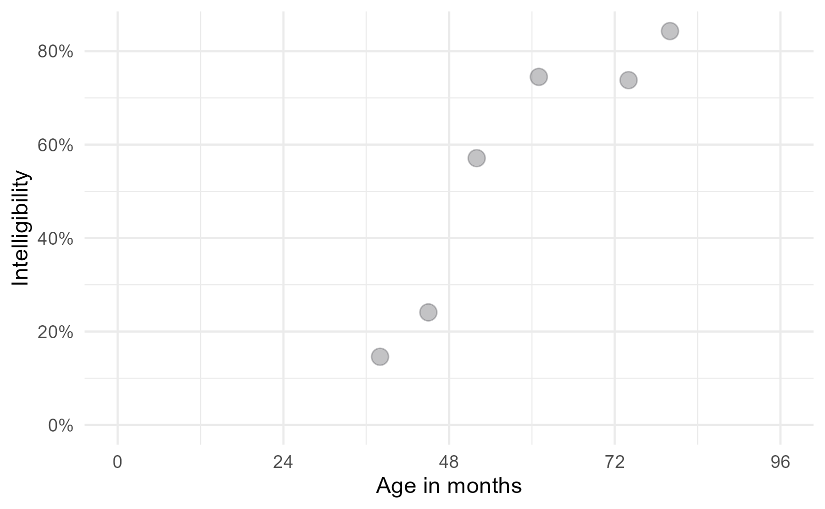
One of the interesting features of speech development is that it finishes: Children stop making the usual developmental speech patterns and converge on a mature level of performance. They will, no doubt, continue grow and change through adolescence, but when it comes to making speech sounds accurately and reliably, most of the developmental change is done by age 8.
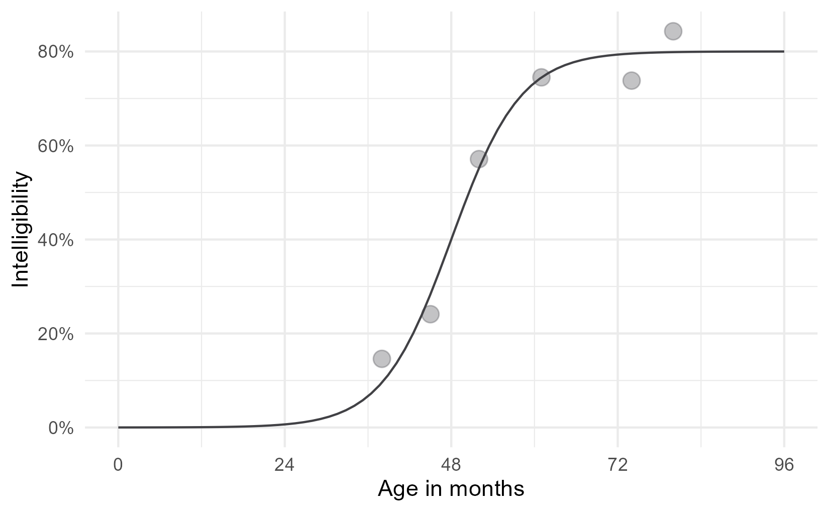
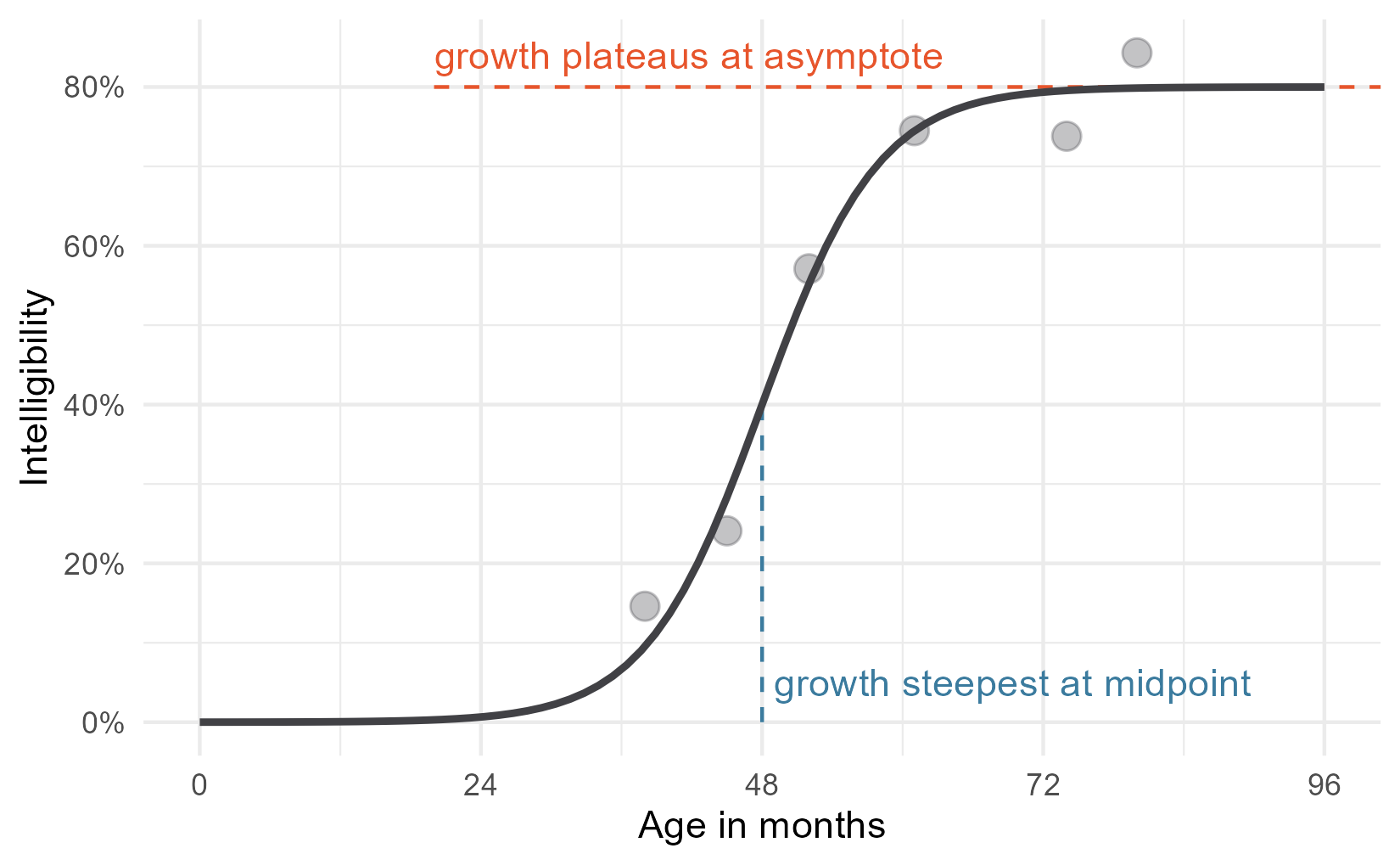
For the statistical models, therefore, we expected children to follow a certain developmental trajectory towards a ceiling: Begin at zero intelligibility, show a period of accelerating then decelerating growth, and finally plateau at some mature level of ability. This pattern of growth can be modelled using a logistic growth curve using three parameters: an asymptote at the ceiling, a midpoint when growth is steepest, and a scale which sets the slope of the curve.1 Below is the equation of the logistic growth curve:
\[f(t) = \frac{\text{asymptote}}{1 + \exp{((\text{mid}~-~t)~*~\text{scale})}}\]But this equation doesn’t do us any good. If you are like me, you probably stopped paying attention when you saw exp() in the denominator. Here’s the logistic curve plotted for these data.
xs <- seq(0, 96, length.out = 80)

# Create the curve from the equation parameters
trend <- tibble(
  age = xs,
  asymptote = .8,
  scale = .2,
  midpoint = 48,
  prop = asymptote / (1 + exp((midpoint - age) * scale)))

ggplot(points) +
  aes(x = age, y = prop) +
  geom_line(data = trend, color = colors$fit) +
  geom_point(size = 3.5, color = colors$data) +
  scale_x_continuous(
    name = "Age in months",
    limits = c(0, 96),
    breaks = scales::extended_breaks(Q = c(24, 12))) +
  scale_y_continuous(
    name = "Intelligibility",
    limits = c(0, NA),
    labels = scales::percent_format(accuracy = 1))
Now, let’s add some labels to mark some key parts of the equation. One
unfamiliar bit of ggplot technology here might be annotate(). Geometry
functions like geom_point() or geom_text() are used to draw data that lives
in a dataframe by using the aesthetic mappings defined in aes(). For example,
in the plot above, aes(x = age) says get the x position for this geometry
from the age column. These functions draw some geometry (like a point or a
label) for each row of the data.
But we don’t have rows and rows of data to draw for an annotation. annotate()
is meant to handle these one-off annotations, and we set the aesthetics manually
instead of pulling them from some data. The first argument of annotate() says
what kind of geom to use for the annotation: for example, "text" calls on
geom_text() and "segment" calls on geom_segment(). The other arguments set
the aesthetics for that geometry.
colors$asym <- "#E7552C"
colors$mid <- "#3B7B9E"
colors$scale <- "#1FA35C"

p <- ggplot(points) +
  aes(x = age, y = prop) +
  annotate(
    "segment",
    color = colors$mid,
    x = 48, xend = 48,
    y = 0, yend = .4,
    linetype = "dashed") +
  annotate(
    "segment",
    color = colors$asym,
    x = 20, xend = Inf,
    y = .8, yend = .8,
    linetype = "dashed") +
  geom_line(data = trend, size = 1, color = colors$fit) +
  geom_point(size = 3.5, color = colors$data) +
  annotate(
    "text",
    label = "growth plateaus at asymptote",
    x = 20, y = .84,
    # horizontal justification = 0 sets x position to left edge of text
    hjust = 0,
    color = colors$asym) +
  annotate(
    "text",
    label = "growth steepest at midpoint",
    x = 49, y = .05,
    hjust = 0,
    color = colors$mid) +
  scale_x_continuous(
    name = "Age in months",
    limits = c(0, 96),
    breaks = scales::extended_breaks(Q = c(24, 12))) +
  scale_y_continuous(
    name = "Intelligibility",
    limits = c(0, NA),
    labels = scales::percent_format(accuracy = 1))

p
Okay, that just leaves the scale parameter.
We need to talk about the scale parameter for a second
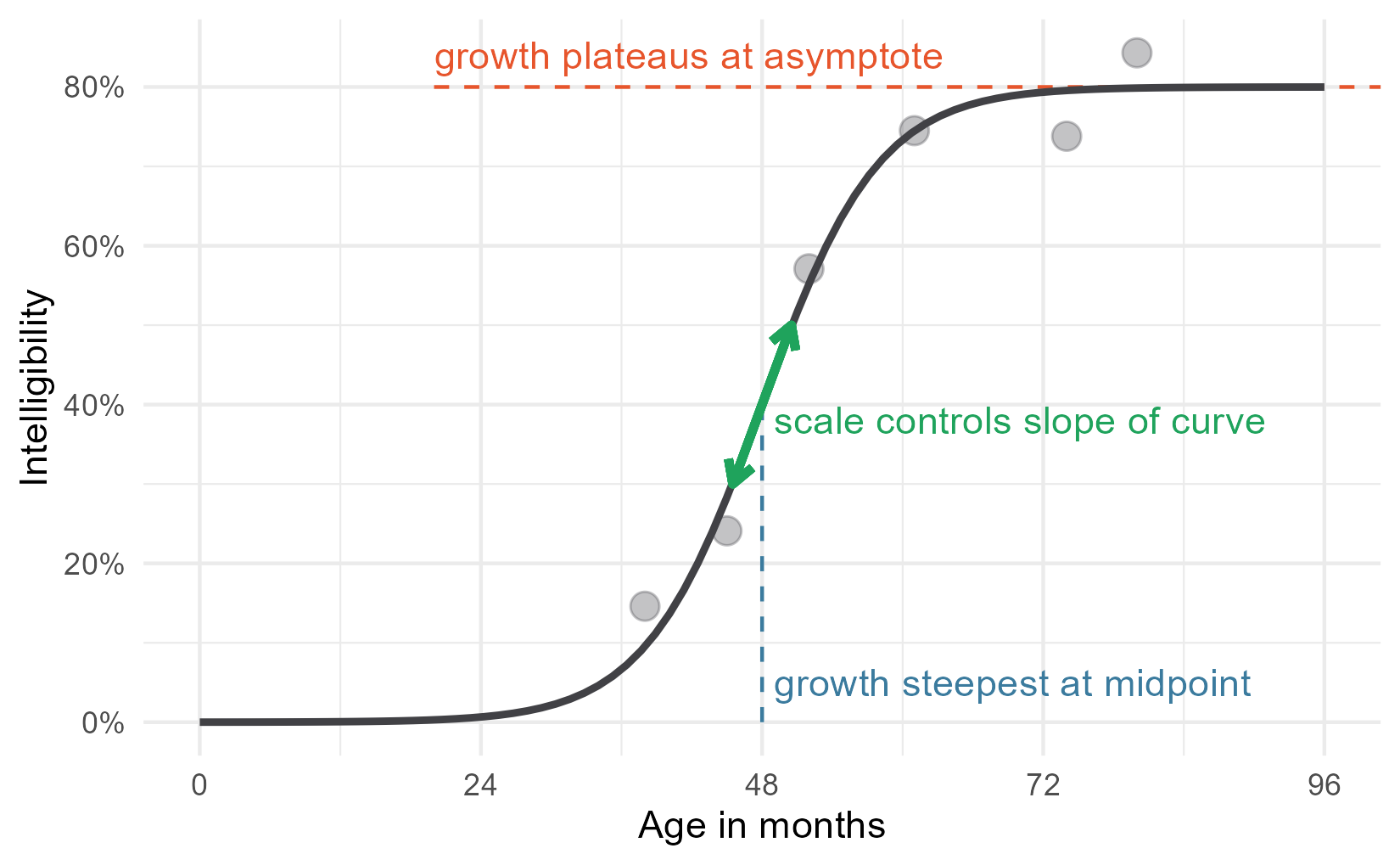
In a sentence, the scale parameter controls how steep the curve is. The logistic curve is at its steepest at the midpoint. Growth accelerates, hits the midpoint, then decelerates. The rate of change on the curve is changing constantly along the course of the curve. Therefore, it doesn’t make sense to talk about the scale as the growth rate or as the slope in any particular location. It’s better to think of it as a growth factor, or umm, scale. I say that it “controls” the slope of the curve, because changing the scale will affect the overall steepness of the curve.
Here is the derivative of the logistic curve. This function tells you the rate of change in the curve at any point.
\[\frac{d}{dt}f(t) = \text{asymptote} * \frac{ \text{scale} * \exp{((\text{mid}~-~t)~*~\text{scale})}}{(1 + \exp{((\text{mid}~-~t)~*~\text{scale})})^2}\]Yeah, I don’t like it either, but I have to show you this mess to show how neat things are at the midpoint of the curve. When t is the midpoint, algebraic magic happens 🎆. All of the (mid − t) parts become 0, exp(0) is 1, so everything simplifies a great deal. Check it out.
\[\begin{align} \frac{d}{dt}f(t = \text{mid}) &= \text{asymptote} * \frac{ \text{scale} * \exp{(0~*~\text{scale})}}{(1 + \exp{(0~*~\text{scale}}))^2} \\ &= \text{asymptote} * \frac{ \text{scale} * 1}{(1 + 1)^2} \\ &= \text{asymptote} * \frac{ \text{scale}}{4} \\ \text{slope at midpoint} &= \text{asymptote} * \frac{ \text{scale}}{4} \\ \end{align}\]In our case, with a scale of .2 and asymptote of .8, the slope at the 48-month midpoint is (.2 / 4) * 8 which is .04. When the curve is at its steepest, for the data illustrated here, intelligibility grows at a rate of 4 percentage points per month. That’s an upper limit on growth rate: This child never gains more than 4 percentage points per month.2
Now, we can add annotate the plot with an arrow with this slope at the midpoint. That seems like a good representation because this point is where the scale is most transparently related to the curve’s shape.
# Compute endpoints for segment with given slope in middle
slope <- (.2 / 4) * .8
x_step <- 2.5
y1 <- .4 + slope * -x_step
y2 <- .4 + slope * x_step

p <- p +
  geom_segment(
    x = 48 - x_step, xend = 48 + x_step,
    y = y1, yend = y2,
    size = 1.2,
    color = colors$scale,
    arrow = arrow(ends = "both", length = unit(.1, "in"))) +
  annotate(
    "text",
    label = "scale controls slope of curve",
    x = 49, y = .38,
    color = colors$scale, hjust = 0)
p
Adding the equation
For my conference submission, I didn’t want to include the equation in the text.
It was just too low-level of a detail for the 600-word limit. So I added the
equation to the plot using plotmath. I’m not exactly sure what
this feature should be called, but ?plotmath is what you type to open the help
page, so that’s what I call it. You can add math to a plot by providing an
expression() which is parsed into mathematical copy, or by passing a string
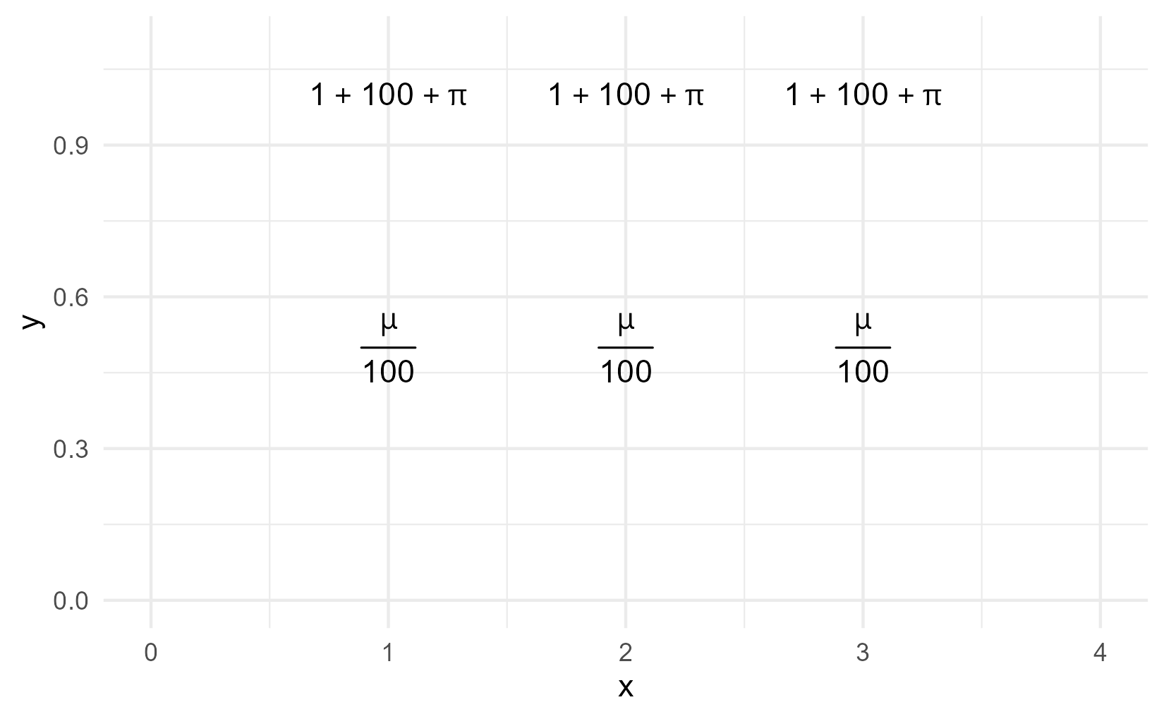
and setting parse = TRUE. Here is a demo of both approaches.
ggplot(tibble(x = 1:3)) +
  aes(x = x) +
  geom_text(
    aes(y = 1),
    label = expression(1 + 100 + pi)) +
  geom_text(
    aes(y = .5),
    label = "frac(mu, 100)",
    parse = TRUE) +
  xlim(0, 4) +
  ylim(0, 1.1)
#> Warning in is.na(x): is.na() applied to non-(list or vector) of type
#> 'expression'

# (I don't know what this warning is about.)
For this plot, we’re going to create a helper function that pre-sets parse to
TRUE and pre-sets the location for the equation.
# Helper to plot an equation in a pre-set spot
annotate_eq <- function(label, ...) {
  annotate("text", x = 0, y = .6, label = label, parse = TRUE,
           hjust = 0, size = 4, ...)
}
Then we just add the equation to the plot.
p + annotate_eq(
    label = "f(t)==frac(asymptote, 1 + exp((mid-t)%*%scale))",
    color = colors$fit)
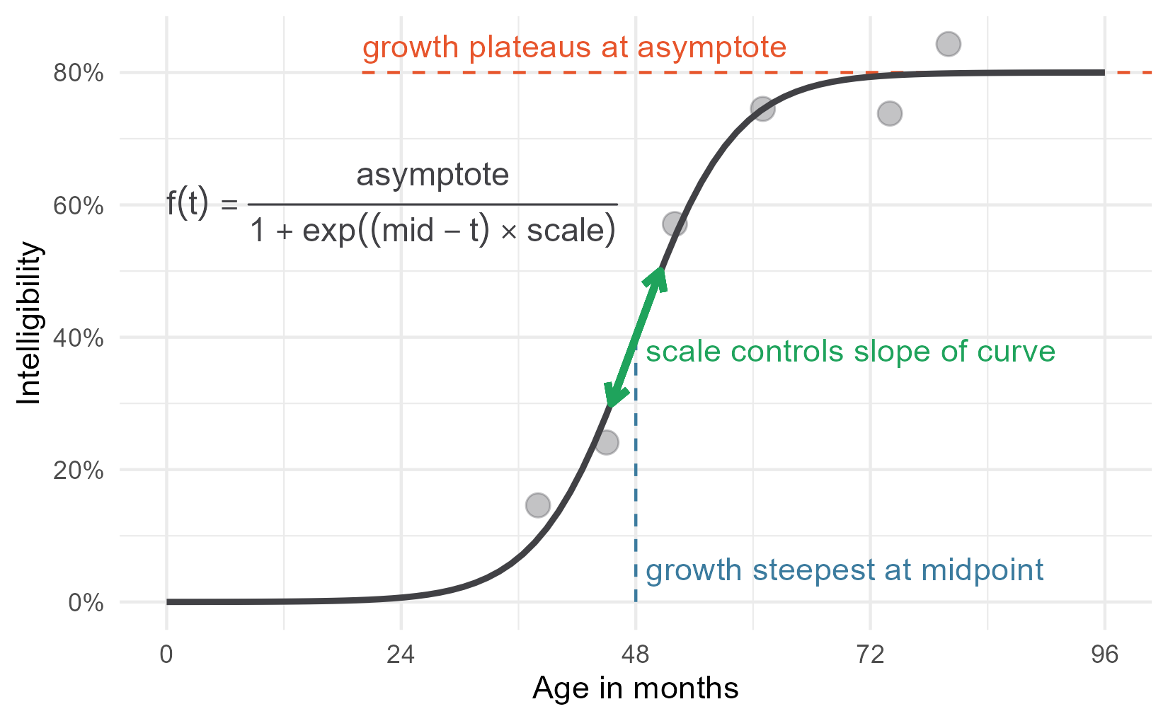
This is a perfectly serviceable plot, but we can get fancier. I gave the parameter annotations different colors for a reason 😉.
Phantom menaces
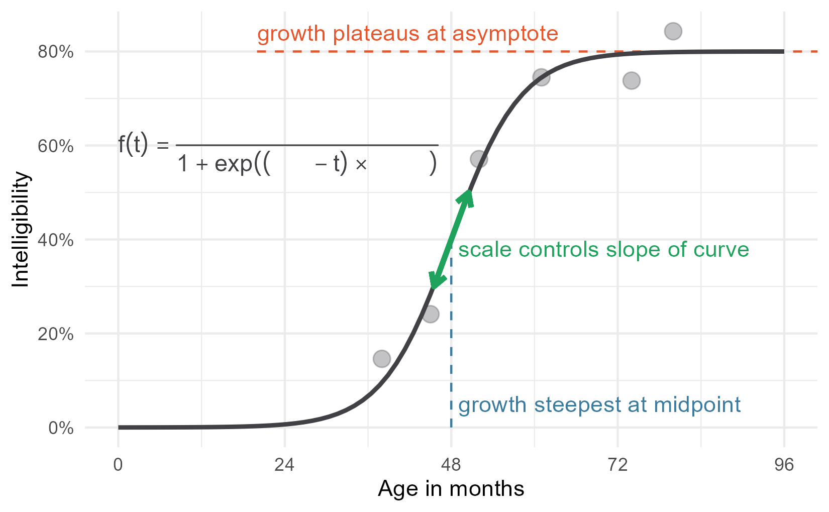
Plotmath provides a function called phantom() for adding placeholders to
an equation. phantom(x) will make space for x in the equation but it
won’t draw it. Therefore, we can phantom() out all of the parameters to draw
the non-parameter parts of the equation in black.
p1 <- p +
  annotate_eq(
    label = "
    f(t) == frac(
      phantom(asymptote),
      1 + exp((phantom(mid) - t) %*% phantom(scale))
    )",
    color = colors$fit)
p1
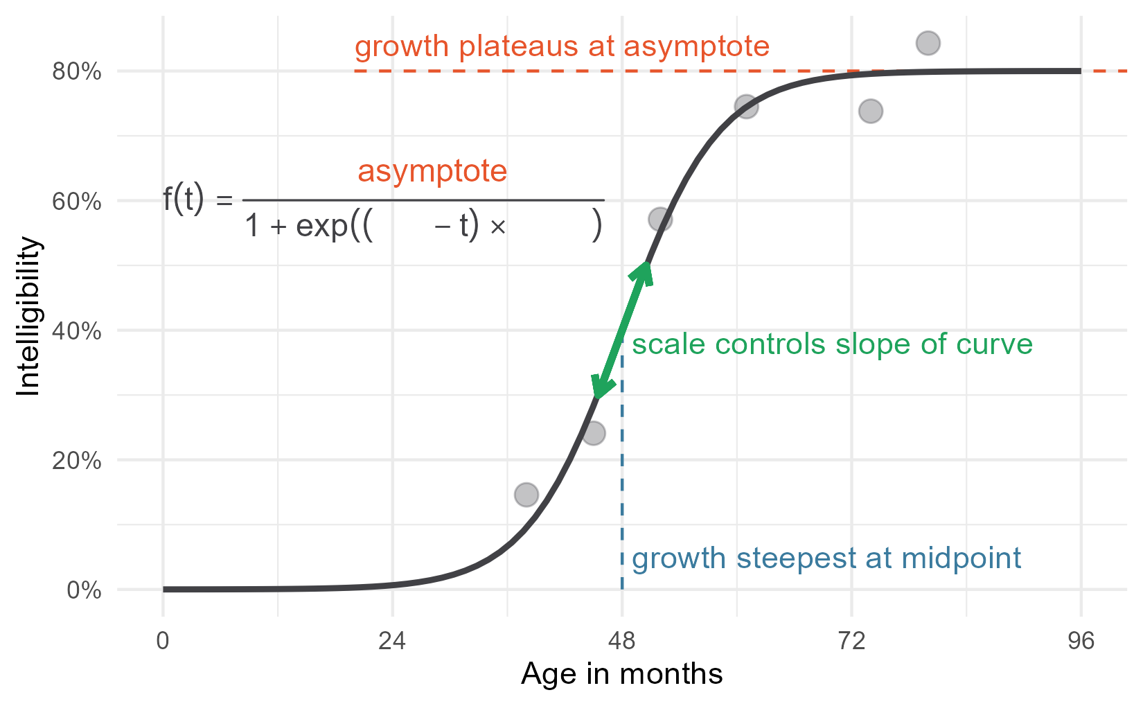
Then we layer on the other parts of the equation in different colors, using
phantom() as needed so we don’t overwrite the black parts. We also use
atop(); it does the same thing as frac() except it doesn’t draw a fraction
line. Here’s the addition of the asymptote.
p2 <- p1 +
  annotate_eq(
    label = "
    phantom(f(t) == symbol('')) ~ atop(
      asymptote,
      phantom(1 + exp((mid-t) %*% scale))
    )",
    color = colors$asym)
p2
But the other parameters are not that simple. The plotmath help page states that
“A mathematical expression must obey the normal rules of syntax for any R
expression”. That warning means that we can’t do something like
phantom(1 + ) x" because the ` 1 + ` is not valid R syntax. So to blank out
parts of expressions, we create expressions using paste() to put symbols next
to each other and symbol() to refer to symbols/operators as characters.
I have to be honest, however: it took a lot of fiddling to get this work right. Therefore, I have added the following disclaimer: 🚨 Don’t study this code. Just observe what is possible, but observe all the hacky code required. 🚨
p2 +
  annotate_eq(
    label = "
    phantom(f(t) == symbol('')) ~ atop(
      phantom(asymptote),
      phantom(1 + exp((mid-t) * symbol(''))) ~ scale
    )",
    color = colors$scale) +
  annotate_eq(
    label = "
    phantom(f(t) == symbol('')) ~ atop(
      phantom(asymptote),
      paste(
        phantom(paste(1 + exp, symbol(')'), symbol(')'))),
        mid,
        phantom(paste(symbol('-'), t, symbol(')') * scale))
      )
    )",
    color = colors$mid)
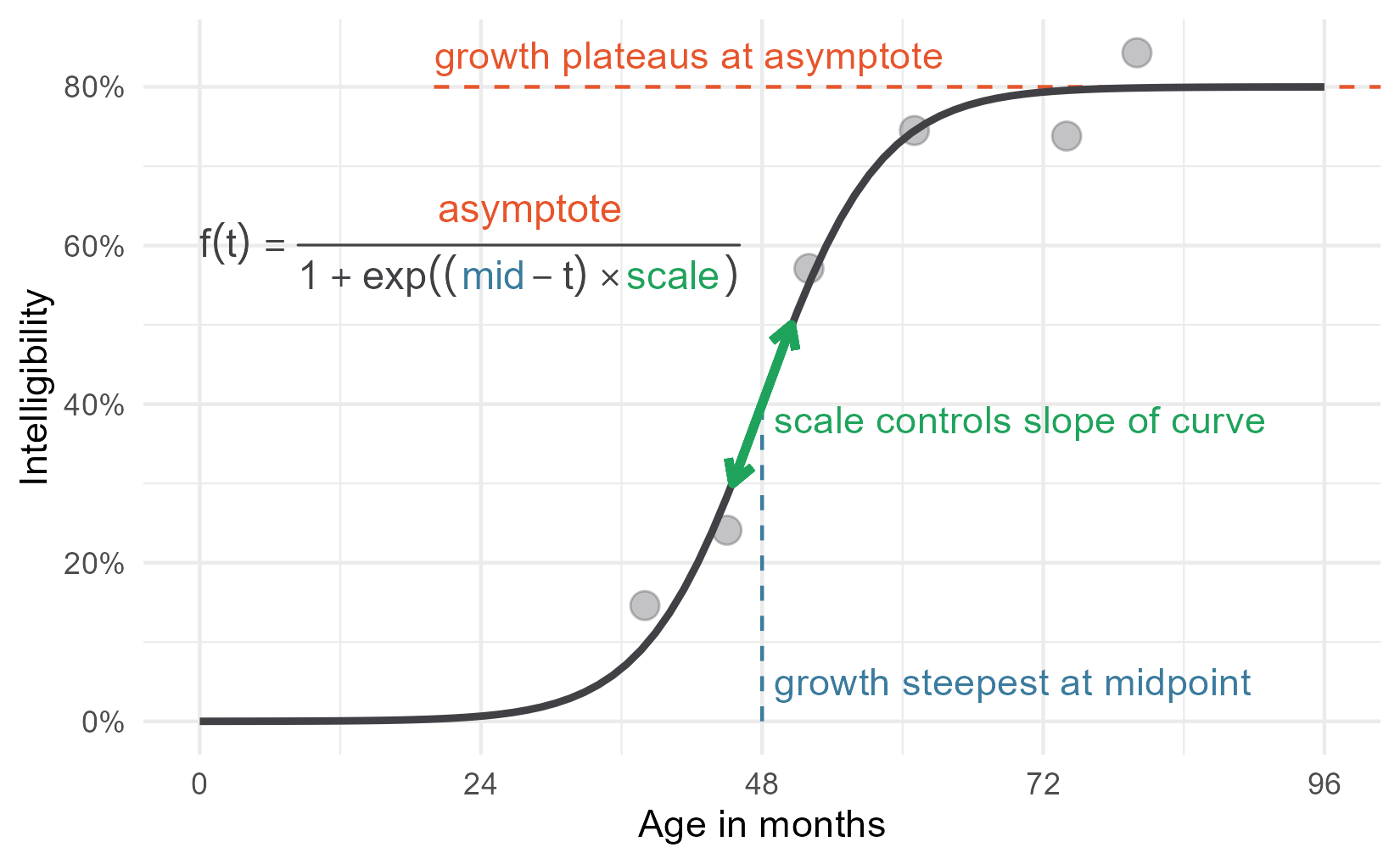
There we have it—my wonderful, colorful diagram! Take that word count!
In future posts, I will start to write about how I go about actually modelling data using this growth curve. This post will serve as a basic reference for how the parameters in the logistic growth curve relate to its shape.
By the way, if you know a better way to plot partially colorized math equations or how to blank out subexpressions in an easier way, I would love to hear it.
Last knitted on 2022-05-27. Source code on GitHub.3
-
By the way, some other ways to describe the asymptote besides “ceiling” or “plateau” would be “saturation” which emphasizes how things only change a small amount near the asymptote or as a “limiting” factor or “capacity” which emphasizes how growth is no longer tenable after a certain point. The capacity language comes from the curve’s use in population growth. In fact, one of the sites that syndicate my blogposts, weirdly attached a population growth diagram to my post.
Another note: You don’t have to assume that one of the asymptotes starts at 0. There is a four-parameter version of the curve that estimates the other asymptote. ↩
-
We could reparameterize the equation to multiply scale by 4 / asymptote, so that the scale parameter comes out to be the slope at the midpoint automatically. If you are using a non-Bayesian procedure and want a confidence interval on the slope at the midpoint, then that parameterization should provide an easy way to do that. I prefer using smaller equations here. ↩
-
.session_info
#> ─ Session info ─────────────────────────────────────────────────────
#>  setting  value
#>  version  R version 4.2.0 (2022-04-22 ucrt)
#>  os       Windows 10 x64 (build 22000)
#>  system   x86_64, mingw32
#>  ui       RTerm
#>  language (EN)
#>  collate  English_United States.utf8
#>  ctype    English_United States.utf8
#>  tz       America/Chicago
#>  date     2022-05-27
#>  pandoc   NA
#>
#> ─ Packages ─────────────────────────────────────────────────────────
#>  package     * version date (UTC) lib source
#>  assertthat    0.2.1   2019-03-21 [1] CRAN (R 4.2.0)
#>  backports     1.4.1   2021-12-13 [1] CRAN (R 4.2.0)
#>  broom         0.8.0   2022-04-13 [1] CRAN (R 4.2.0)
#>  cellranger    1.1.0   2016-07-27 [1] CRAN (R 4.2.0)
#>  cli           3.3.0   2022-04-25 [1] CRAN (R 4.2.0)
#>  colorspace    2.0-3   2022-02-21 [1] CRAN (R 4.2.0)
#>  crayon        1.5.1   2022-03-26 [1] CRAN (R 4.2.0)
#>  DBI           1.1.2   2021-12-20 [1] CRAN (R 4.2.0)
#>  dbplyr        2.1.1   2021-04-06 [1] CRAN (R 4.2.0)
#>  digest        0.6.29  2021-12-01 [1] CRAN (R 4.2.0)
#>  dplyr       * 1.0.9   2022-04-28 [1] CRAN (R 4.2.0)
#>  ellipsis      0.3.2   2021-04-29 [1] CRAN (R 4.2.0)
#>  evaluate      0.15    2022-02-18 [1] CRAN (R 4.2.0)
#>  fansi         1.0.3   2022-03-24 [1] CRAN (R 4.2.0)
#>  farver        2.1.0   2021-02-28 [1] CRAN (R 4.2.0)
#>  forcats     * 0.5.1   2021-01-27 [1] CRAN (R 4.2.0)
#>  fs            1.5.2   2021-12-08 [1] CRAN (R 4.2.0)
#>  generics      0.1.2   2022-01-31 [1] CRAN (R 4.2.0)
#>  ggplot2     * 3.3.6   2022-05-03 [1] CRAN (R 4.2.0)
#>  git2r         0.30.1  2022-03-16 [1] CRAN (R 4.2.0)
#>  glue          1.6.2   2022-02-24 [1] CRAN (R 4.2.0)
#>  gtable        0.3.0   2019-03-25 [1] CRAN (R 4.2.0)
#>  haven         2.5.0   2022-04-15 [1] CRAN (R 4.2.0)
#>  here          1.0.1   2020-12-13 [1] CRAN (R 4.2.0)
#>  highr         0.9     2021-04-16 [1] CRAN (R 4.2.0)
#>  hms           1.1.1   2021-09-26 [1] CRAN (R 4.2.0)
#>  httr          1.4.3   2022-05-04 [1] CRAN (R 4.2.0)
#>  jsonlite      1.8.0   2022-02-22 [1] CRAN (R 4.2.0)
#>  knitr       * 1.39    2022-04-26 [1] CRAN (R 4.2.0)
#>  labeling      0.4.2   2020-10-20 [1] CRAN (R 4.2.0)
#>  lifecycle     1.0.1   2021-09-24 [1] CRAN (R 4.2.0)
#>  lubridate     1.8.0   2021-10-07 [1] CRAN (R 4.2.0)
#>  magrittr      2.0.3   2022-03-30 [1] CRAN (R 4.2.0)
#>  modelr        0.1.8   2020-05-19 [1] CRAN (R 4.2.0)
#>  munsell       0.5.0   2018-06-12 [1] CRAN (R 4.2.0)
#>  pillar        1.7.0   2022-02-01 [1] CRAN (R 4.2.0)
#>  pkgconfig     2.0.3   2019-09-22 [1] CRAN (R 4.2.0)
#>  purrr       * 0.3.4   2020-04-17 [1] CRAN (R 4.2.0)
#>  R6            2.5.1   2021-08-19 [1] CRAN (R 4.2.0)
#>  ragg          1.2.2   2022-02-21 [1] CRAN (R 4.2.0)
#>  readr       * 2.1.2   2022-01-30 [1] CRAN (R 4.2.0)
#>  readxl        1.4.0   2022-03-28 [1] CRAN (R 4.2.0)
#>  reprex        2.0.1   2021-08-05 [1] CRAN (R 4.2.0)
#>  rlang         1.0.2   2022-03-04 [1] CRAN (R 4.2.0)
#>  rprojroot     2.0.3   2022-04-02 [1] CRAN (R 4.2.0)
#>  rstudioapi    0.13    2020-11-12 [1] CRAN (R 4.2.0)
#>  rvest         1.0.2   2021-10-16 [1] CRAN (R 4.2.0)
#>  scales        1.2.0   2022-04-13 [1] CRAN (R 4.2.0)
#>  sessioninfo   1.2.2   2021-12-06 [1] CRAN (R 4.2.0)
#>  stringi       1.7.6   2021-11-29 [1] CRAN (R 4.2.0)
#>  stringr     * 1.4.0   2019-02-10 [1] CRAN (R 4.2.0)
#>  systemfonts   1.0.4   2022-02-11 [1] CRAN (R 4.2.0)
#>  textshaping   0.3.6   2021-10-13 [1] CRAN (R 4.2.0)
#>  tibble      * 3.1.7   2022-05-03 [1] CRAN (R 4.2.0)
#>  tidyr       * 1.2.0   2022-02-01 [1] CRAN (R 4.2.0)
#>  tidyselect    1.1.2   2022-02-21 [1] CRAN (R 4.2.0)
#>  tidyverse   * 1.3.1   2021-04-15 [1] CRAN (R 4.2.0)
#>  tzdb          0.3.0   2022-03-28 [1] CRAN (R 4.2.0)
#>  utf8          1.2.2   2021-07-24 [1] CRAN (R 4.2.0)
#>  vctrs         0.4.1   2022-04-13 [1] CRAN (R 4.2.0)
#>  withr         2.5.0   2022-03-03 [1] CRAN (R 4.2.0)
#>  xfun          0.31    2022-05-10 [1] CRAN (R 4.2.0)
#>  xml2          1.3.3   2021-11-30 [1] CRAN (R 4.2.0)
#>
#>  [1] C:/Users/Tristan/AppData/Local/R/win-library/4.2
#>  [2] C:/Program Files/R/R-4.2.0/library
#>
#> ────────────────────────────────────────────────────────────────────

Leave a comment