One of the things I have come to appreciate is how programming is a great way to learn statistics. My eyes will glaze over at a series of equations in a derivation, but ask me to program the procedure and I’ll never forget how it works. This post will be one of those exercises where we program a statistical tool—a Q-Q plot (plus its friend the worm plot)—from scratch as a learning exercise.
A quantile-quantile plot—more commonly, a “Q-Q plot”, or
more descriptively, a “quantile comparison plot”—is a way to compare two
distributions of data. These plots are a common diagnostic tool when we need to
check a distributional assumption. For example, residual errors from a linear
regression model should normally distributed, and indeed, one of the premade
diagnostic plots for an lm() model is Q-Q plot of the residual errors.
plot(lm(mpg ~ wt, mtcars), which = 2, id.n = 0)
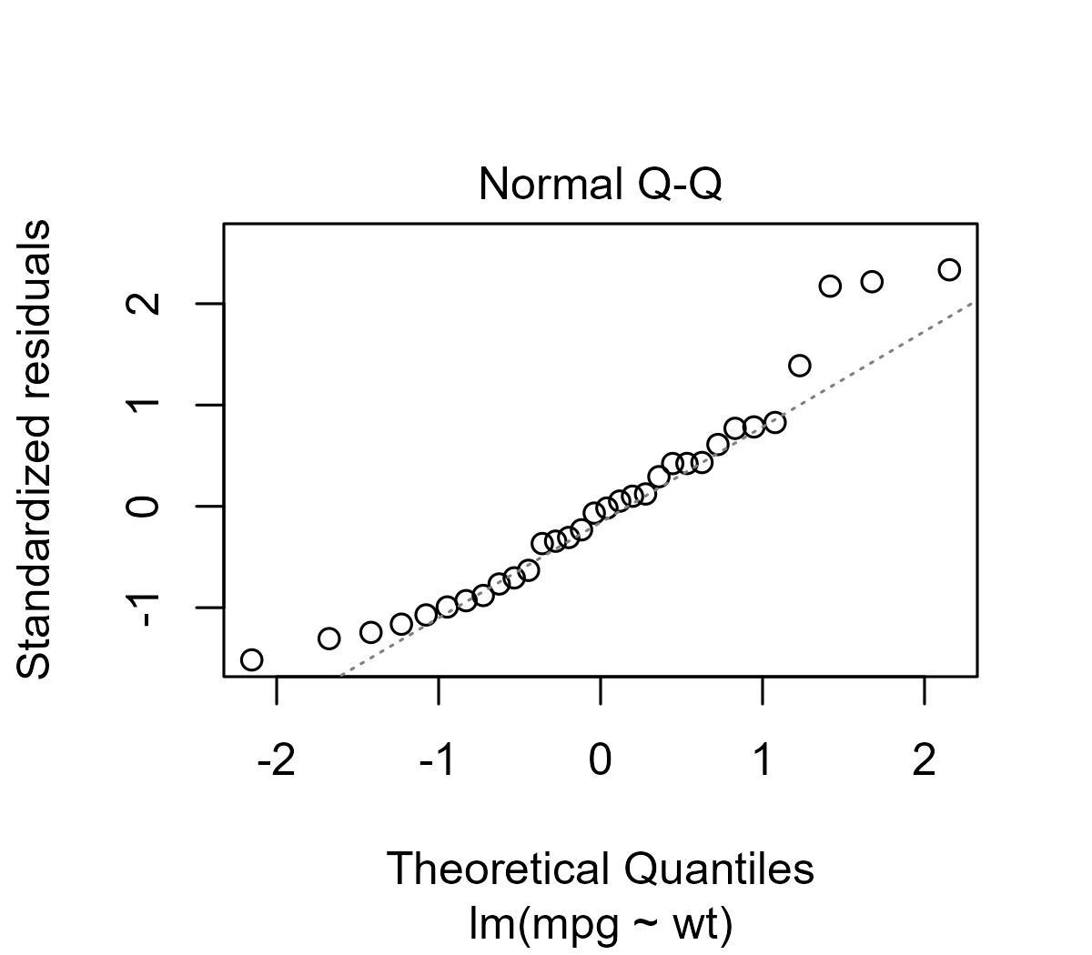
Reading these plots is a bit of an art, but Sean Kross provides a tutorial on how to interpret these plots and walks through diagnostic examples of “bad” Q-Q plots for skewed or fat-tailed distributions.
In this post, we are going to make Q-Q plots from scratch. My motivation for this post are a couple of recent cases where I had to manually create Q-Q plots for models where the distribution is estimated from the data and had to create worm plots, an alternative to the Q-Q plot. During this process I discovered that I misunderstood what is shown on the conventional Q-Q plot, and I feel like I need to document what these plots are really showing.
Update: Q-Q plots avant la lettre. Originally, this post in its header image
attributed the first Q-Q plots to Hazen
(1914), but a
reader sent a French Wikipedia
article that attributes Q-Q
plots to P. J. P. Henri in the 1880s. [Sept. 4, 2020]
Michael Friendly, a historian of statistical
visualization, also emailed to report that he and a colleague traced Q-Q
plots back to P. J. P. Henri. He also notes that he first popularized
the idea of worm plots (discussed below) in his 1991
book. He called them “detrended Q-Q
plots” and implemented them in the NQPLOT macro. [Oct. 14, 2020]
The Q-Q points are easy to calculate
Fox’s regression textbook (2016, p. 38–39) provides a step-by-step
procedure for building a Q-Q plot and includes a great implementation in the
book’s companion R package with car::qqPlot(). His procedure will be the
basis for the math in this post
The first step is to convert ranks into quantiles. One naive approach might be dividing ranks by the length:
# generate data for this post
set.seed(20200825)
x <- sort(rnorm(20, 10, 3))

# naive quantiles
rank(x) / length(x)
#>  [1] 0.05 0.10 0.15 0.20 0.25 0.30 0.35 0.40 0.45 0.50 0.55 0.60 0.65 0.70 0.75
#> [16] 0.80 0.85 0.90 0.95 1.00
With 20 observations, 1 point is 5% of the data, so the quantiles increase by .05 with each step from .05 to 1.00. The problem here is that we get a quantile of 1. When we look up the quantiles from theoretical distributions, quantiles of 0 and 1 break things:1
# 0 and 1 quantiles of a normal distribution
qnorm(c(0, 1))
#> [1] -Inf  Inf
Instead, we will adjust the ranks by 1/2, so that the quantiles are “centered” in their .05 bins. That is, the first quantile of .05 will become .025.
q <- (rank(x) - .5) / length(x)
q
#>  [1] 0.025 0.075 0.125 0.175 0.225 0.275 0.325 0.375 0.425 0.475 0.525 0.575
#> [13] 0.625 0.675 0.725 0.775 0.825 0.875 0.925 0.975
R provides a function for this purpose, ppoints(), but it includes extra
smarts for when there are 10 or fewer values. Otherwise, it does the same
adjustment by .5 that we are using.
ppoints
#> function (n, a = if (n <= 10) 3/8 else 1/2)
#> {
#>     if (length(n) > 1L)
#>         n <- length(n)
#>     if (n > 0)
#>         (1L:n - a)/(n + 1 - 2 * a)
#>     else numeric()
#> }
#> <bytecode: 0x000002038a6598b0>
#> <environment: namespace:stats>
Given these quantiles, we can look up which values have these quantiles in various distributions. For example, for a normal distribution with a mean of 100 and standard deviation of 15, the corresponding quantiles would be:
round(qnorm(q, 100, 15))
#>  [1]  71  78  83  86  89  91  93  95  97  99 101 103 105 107 109 111 114 117 122
#> [20] 129
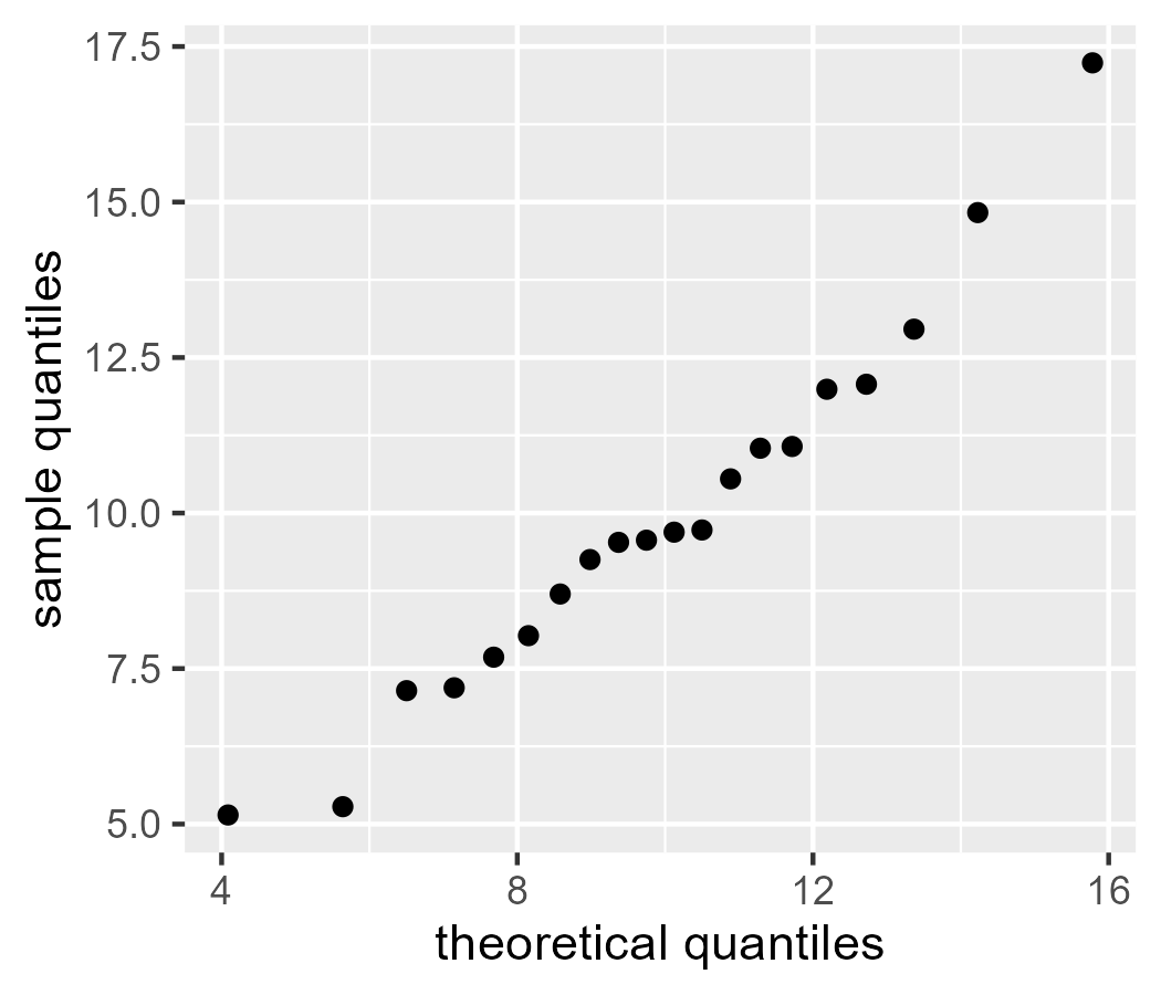
Or, more to the point, we can project our observed data onto a normal distribution with the same mean and standard deviation as our data.
qnorm(q, mean(x), sd(x))
#>  [1]  4.087038  5.639679  6.502415  7.146107  7.680649  8.150992  8.580590
#>  [8]  8.983711  9.370120  9.747252 10.121407 10.498539 10.884947 11.288068
#> [15] 11.717667 12.188009 12.722552 13.366243 14.228980 15.781621
Let’s bundle things into a dataframe and start making some plots.
library(tibble)
library(ggplot2)

d <- tibble(
  x_sample = x,
  quantile = ppoints(length(x_sample)),
  x_theoretical = qnorm(q, mean(x_sample), sd(x_sample))
)

ggplot(d) +
  geom_point(aes(x = x_theoretical, y = x_sample)) +
  labs(
    x = "theoretical quantiles",
    y = "sample quantiles"
  )
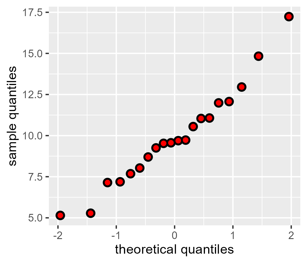
If we project onto the z-score distribution—that is, a “unit normal”, a normal with mean 0 and standard deviation 1—our points (black) match the Q-Q plot provided by ggplot2 (red points):
d$z_theoretical <- qnorm(d$quantile, 0, 1)

ggplot(d) +
  geom_point(aes(x = z_theoretical, y = x_sample), size = 3) +
  geom_qq(aes(sample = x_sample), color = "red") +
  labs(
    x = "theoretical quantiles",
    y = "sample quantiles"
  )
A math-less description of what we are doing
We can think of this quantile-quantile procedure in terms of database operations:
- Start with two tables
aandbwith the same numbers of rows - For each one, create a
quantile“index” for the value of interest. - Now join the datasets using the quantile index:
left_join(a, b, by =
"quantile")
If a and b were tables of real-life collected data, that’s the procedure we
would follow. For Q-Q plots, however, the second dataset b almost always isn’t
a table of observations. Instead, we “look up” the values using math by
computing values from a theoretical distribution. (Or in an older stats
textbook, you actually would look up these values in a table in the back of the
book.)
The Q-Q line is trickier
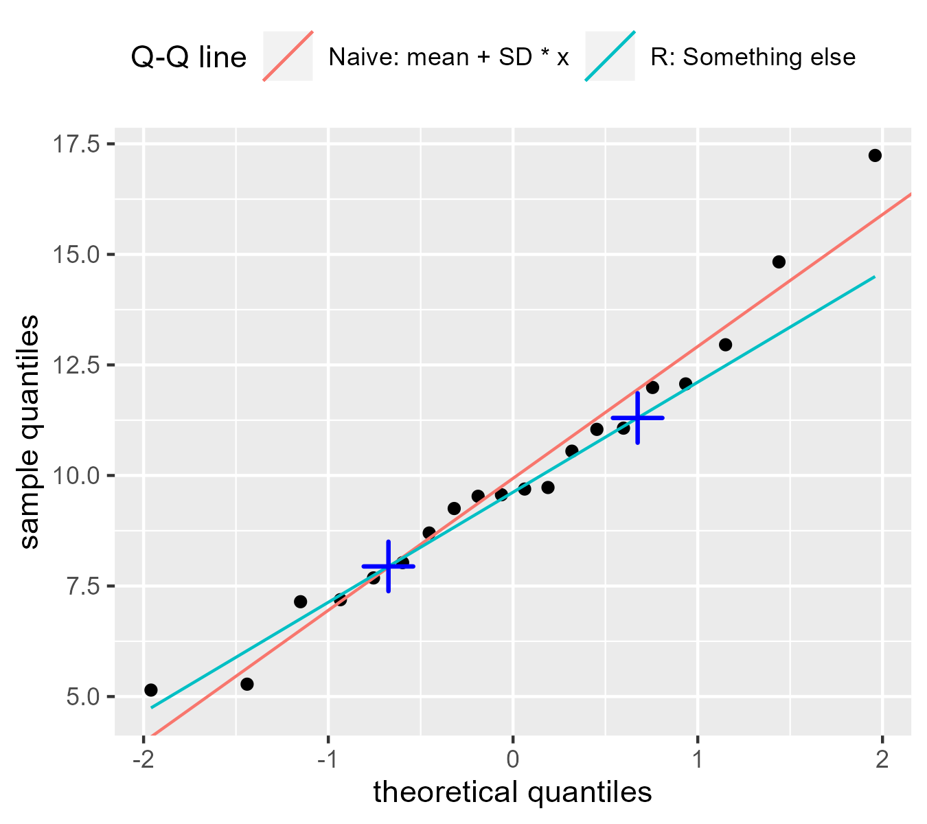
Q-Q plots usually come with a reference line so that we can assess whether the two sets of quantiles follow a linear trend. Until recently, I thought the line was \(y = \mathrm{mean} + \mathrm{SD} * x\), so that the line increased by one standard deviation on the sample scale (y) given a one standard deviation change in the theoretical scale (x). But that is not the case:
p <- ggplot(d) +
  geom_point(aes(x = z_theoretical, y = x_sample)) +
  geom_abline(
    aes(intercept = mean, slope = sd, color = "Naive: mean + SD * x"),
    data = tibble(sd = sd(d$x_sample), mean = mean(d$x_sample))
  ) +
  geom_qq_line(
    aes(sample = x_sample, color = "R: Something else"),
    # use the abline glyph in the legend
    key_glyph = draw_key_abline
  ) +
  labs(
    color = "Q-Q line",
    x = "theoretical quantiles",
    y = "sample quantiles"
  ) +
  guides(color = guide_legend(nrow = 1)) +
  theme(legend.position = "top", legend.justification =  "left")
p
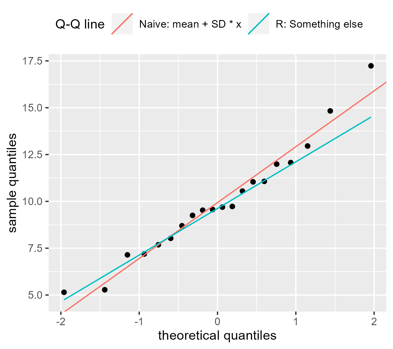
This recent discovery mystified me. This line from the help page for
qqline() offered a clue:
qqlineadds a line to a “theoretical”, by default normal, quantile-quantile plot which passes through the probs quantiles, by default the first and third quartiles.
Indeed, if we draw points at the .25 and .75 quantiles, we can see that the they land on R’s Q-Q line.
anchors <- tibble(
  x = qnorm(c(.25, .75)),
  y = quantile(d$x_sample, c(.25, .75))
)

p +
  geom_point(
    aes(x = x, y = y),
    data = anchors,
    shape = 3,
    size = 5,
    stroke = 1.1,
    color = "blue"
  )
Fox explains that this is a “robust” estimate for the line:
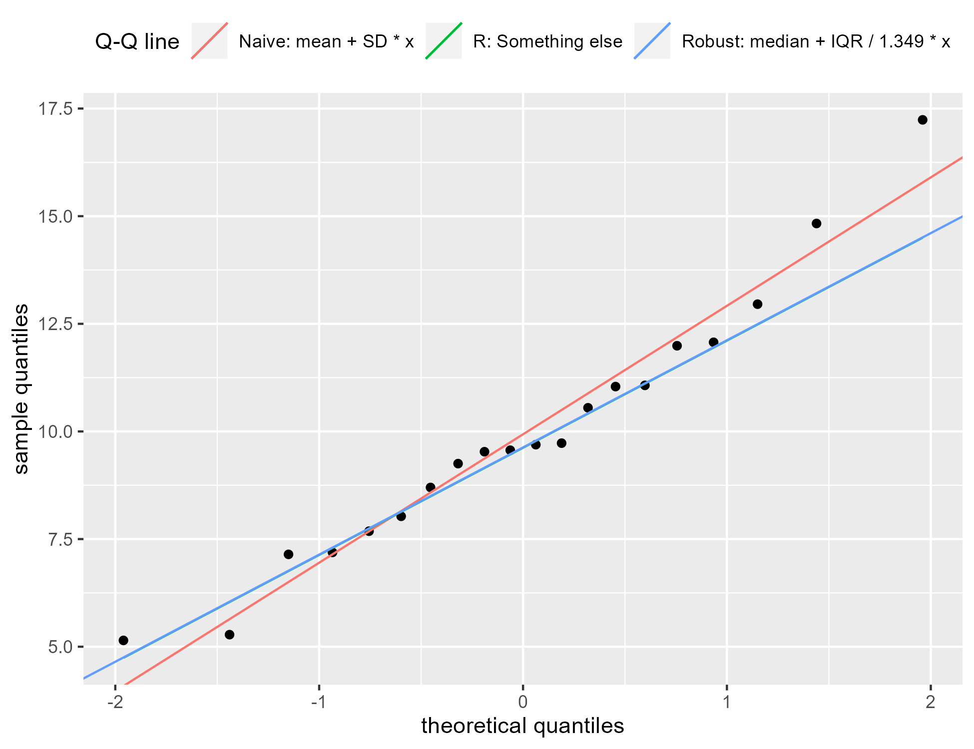
We can alternatively use the median as a robust estimator of [the mean] and the interquartile range / 1.349 as a robust estimator of [the standard deviation]. (The more conventional estimates [of the sample mean and SD] will not work well when the data are substantially non-normal.) [p. 39].
We can confirm the previous plot by updating the previous plot. We draw a third
line for the robust estimate and it follows the line from geom_qqline().
p +
  geom_abline(
    aes(
      intercept = mean,
      slope = sd,
      color = "Robust: median + IQR / 1.349 * x"
    ),
    data = tibble(
      sd = IQR(d$x_sample) / 1.349,
      mean = median(d$x_sample)
    )
  )
A confidence band helps
One problem with these Q-Q plots is that it is hard to tell whether the points are straying too far away from the line. We can include a 95% confidence band to support interpretation. Fox provides an equation for the standard error for a quantile.
\[\mathrm{SE}(X_i) = \frac{\hat{\sigma}}{p(z_i)}\sqrt{\frac{P_i(1-P_i)}{n}} \\ \begin{align} X_i &: \mathrm{the\ }{i}\mathrm{^{th}\ observation} \\ P_i &: \mathrm{probabilities\ from\ }\mathtt{ppoints()} \\ p() &: \mathrm{a\ probability\ density\ function\ like\ }\mathtt{dnorm()} \\ z_i &: \mathrm{theoretical\ quantile\ like\ }\mathtt{qnorm(}P_i\mathtt{)} \\ \hat{\sigma} &: \mathrm{estimated\ standard\ deviation}\\ \end{align}\]The equation appears to be the square root of the variance of a quantile. The right part under the square root also looks like the standard error of proportion, so we could think of this equation as rescaling the standard error of a proportion.
The function se_z() applies the equation to a z-score (the theoretical
values on the x axis).
# Given z scores and n, produce a standard error
se_z <- function(z, n) {
  sqrt(pnorm(z) * (1 - pnorm(z)) / n) / dnorm(z)
}
In the code below, we create a grid of 300 z values and compute the standard error at those values. We weight the standard errors by the standard deviation to convert to the sample scale and multiply the standard errors by 2 and -2 to get approximate 95% intervals around the reference lines. We do this whole procedure again but using robust estimates.
band <- tibble(
  z = seq(-2.2, 2.2, length.out = 300),
  n = length(d$x_sample),

  sample_sd = sd(d$x_sample),
  se = sample_sd * se_z(z, n),
  line = mean(d$x_sample) + sample_sd * z,
  upper = line + 2 * se,
  lower = line - 2 * se,

  robust_sd = IQR(d$x_sample) / 1.349,
  robust_line = median(d$x_sample) + z * robust_sd,
  robust_se =  robust_sd * se_z(z, n),
  robust_upper = robust_line + 2 * robust_se,
  robust_lower = robust_line - 2 * robust_se,
)

ggplot(d) +
  geom_point(aes(x = z_theoretical, y = x_sample)) +
  geom_abline(
    aes(intercept = mean, slope = sd),
    data = tibble(sd = sd(d$x_sample), mean = mean(d$x_sample))
  ) +
  geom_ribbon(
    aes(x = z, ymax = upper, ymin = lower),
    data = band,
    fill = NA,
    color = "black",
    show.legend = FALSE
  ) +
  labs(
    x = "theoretical quantiles",
    y = "sample quantiles"
  ) +
  theme(legend.position = "top", legend.justification =  "left")
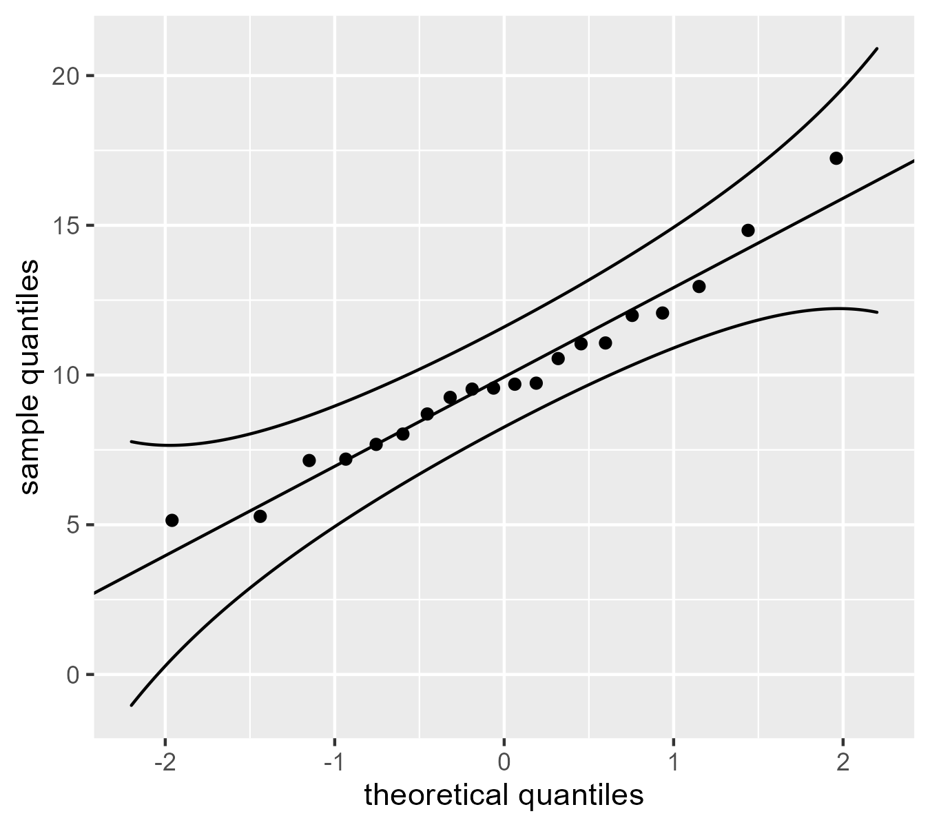
We would like to see these points track along the reference line, but the confidence band shows that we can expect the quantiles in the tails will be a little noisier than the ones in the middle. Fox notes that these confidence values are pointwise (applying to individual points) and not simultaneous (applying to the whole band), meaning there is “there is a greater probability that at least point point strays outside the envelope even if the data are sampled from the comparison distribution. [p. 39, footnote]”. (I am not quite sure what that means, honestly. I know what the distinction means for smooths but not for this case.)
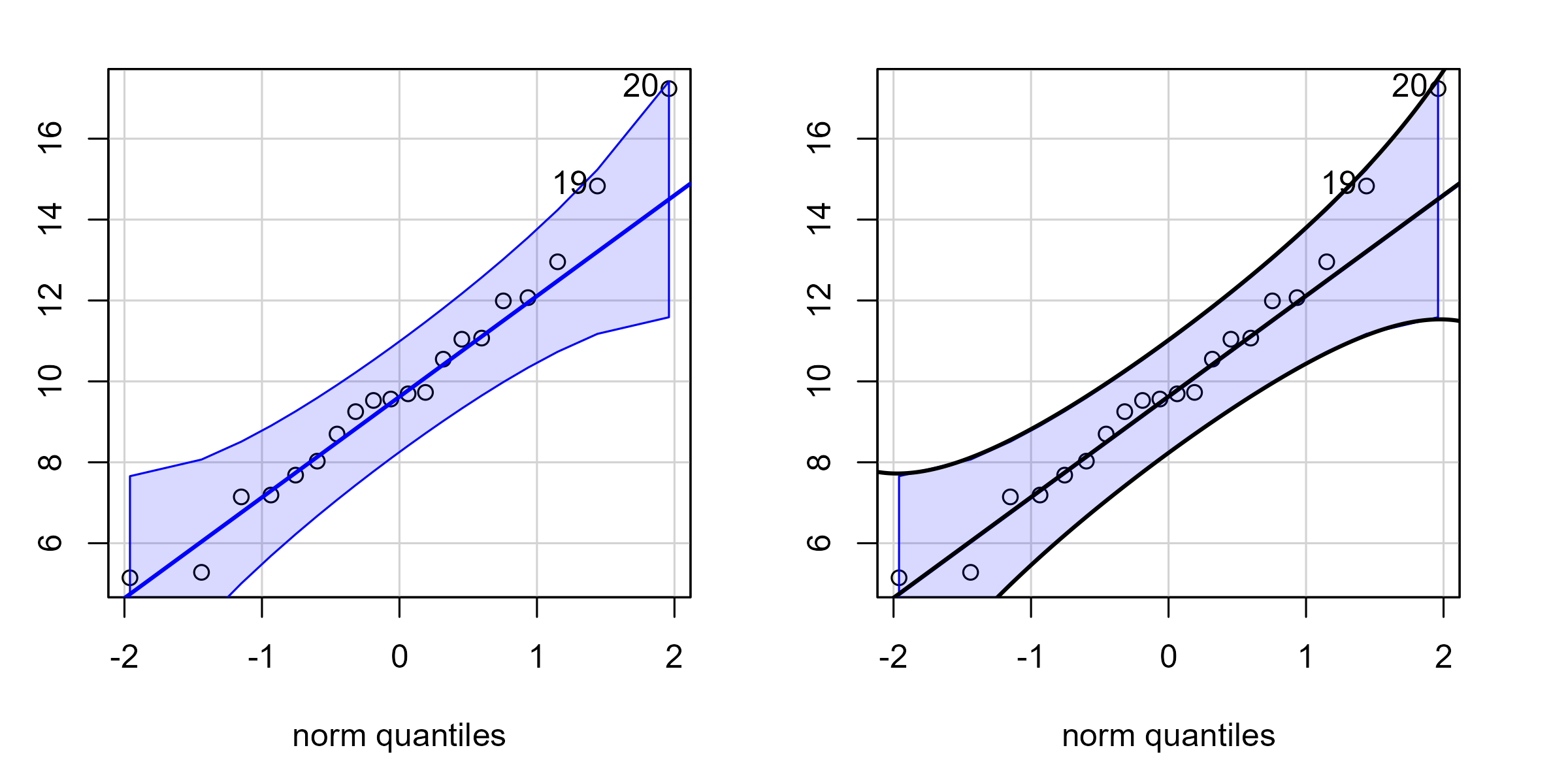
Let’s also check our work against the car package which provides robust confidence bands with its Q-Q plots. We first plot the car package’s Q-Q plot and observe its confidence band in blue. Then we plot it again but draw black lines for our hand-calculated confidence band. Because our lines overlap the car package’s lines, we essentially match its implementation. (Internally, it uses 1.96 standard errors. We used 2 standard errors.)
# Set margins on Q-Q plots
par(mar = c(4, 2, 1, 2))

# Use patchwork to capture the plots and combine them
# into a side by side display.
library(patchwork)
p1 <- wrap_elements(~ car::qqPlot(x))

p2 <- wrap_elements(~ {
  car::qqPlot(x)
  lines(band$z, band$robust_line, col = "black", lwd = 2)
  lines(band$z, band$robust_upper, col = "black", lwd = 2)
  lines(band$z, band$robust_lower, col = "black", lwd = 2)
})

p1 + p2
Worm plots 🐛
Finally, I would like to implement my preferred alternative to Q-Q plot: the worm plot. I first encountered these in the gamlss package. The idea is appealing: The Q-Q plot wastes a lot of vertical space showing a line go upwards. If we remove that line—or rotate it to be a horizontal line—then we can devote the vertical space in the plot for showing the deviation around the reference line. These are sometimes called “detrended” Q-Q plots because they remove the diagonal trend of the Q-Q comparison line.
We can use the gamlss implementation if we pretend that the data are residuals from a model:
par(mar = c(4.5, 4.5, 1, 2))

# I don't know what's up with that error message.

# use scale() to transform in to z-score
gamlss::wp(
  resid = scale(d$x_sample),
  xlim.all = 2.5,
  line = FALSE
)
#> Error in coef(fit): object 'fit' not found
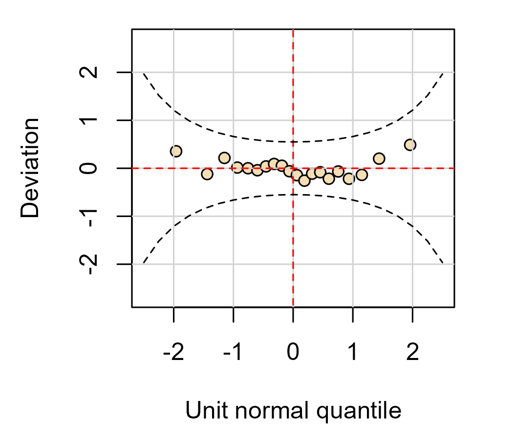
This plot shows the basic idea: We are comparing quantiles along a line and we have a confidence band that helps us gauge the deviation around that line.
Because the “trend” we are going to “detrend” is just a reference line, we can detrend the data by subtracting the line. Here we use the “naive” calculation of the line for a worm plot.
d$line <- mean(d$x_sample) + d$z_theoretical * sd(d$x_sample)

ggplot(d) +
  geom_point(
    aes(x = z_theoretical, y = x_sample - line)
  ) +
  geom_hline(yintercept = 0) +
  geom_ribbon(
    # don't add the line to the SEs
    aes(x = z, ymax = 2 * se, ymin = - 2 * se),
    data = band,
    fill = NA,
    color = "black"
  ) +
  labs(
    x = "theoretical quantiles",
    y = "sample deviation"
  )
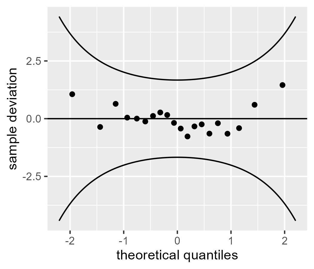
The values on the y axis differ between this plot and the one from wp().
That’s because the data for wp() were fully rescaled with scale(): They were
mean-centered and divided by the standard deviation to become z scores. Here
we only subtracted the mean line.
Q-Q Recap
That covers the main points I’d like to make about Q-Q plots:
- We are joining two distributions together using quantiles and comparing them visually.
- The default Q-Q plot uses robust estimates of the mean and standard deviation.
car::qqPlot()provides the best option for routine visualization.- Worm plots subtract the reference line from the points, so I think they are better option.
Bonus: Let’s create stat_worm()
I would like to implement a basic normal-family worm plot in ggplot2 so that I
can call stat_worm() and stat_worm_band(). I would also like to learn how to
write my own extensions to ggplot2, so this task is useful learning exercise. I
admit that I copied extensively from some sources:
- The source
code for
stat_qq() - The extensions vignette for ggplot2
- The extensions chapters in the ggplot2 book
The code walkthrough below will make the work seem effortless, but I spent a while trying to figure it out!
The apparent workflow is to write a user-facing “layer” function and
then create ggProto() objects that do the work behind the scenes, so
that’s what we will do.
We start with stat_worm(). I copied the stat_qq() source code and
removed some options for supporting other distributions. I
code-commented above the lines that are not boilerplate.
stat_worm <- function(
  mapping = NULL,
  data = NULL,
  geom = "point",
  position = "identity",
  ...,
  # important part
  robust = FALSE,
  na.rm = FALSE,
  show.legend = NA,
  inherit.aes = TRUE
) {
  layer(
    data = data,
    mapping = mapping,
    # important part
    stat = StatWorm,
    geom = geom,
    position = position,
    show.legend = show.legend,
    inherit.aes = inherit.aes,
    # important part
    params = list(
      robust = robust,
      na.rm = na.rm,
      ...
    ),
  )
}
The main work will be carried out by stat = StatWorm, the
ggProto object that will do the calculations. The computed values will be
drawn, by default, with geom = "point". I provide an option for robust
estimates in the function arguments and in the list of params.
Now we create StatWorm. The default_aes and required_aes set up the
aesthetic mappings. The main work is in compute_group(). It will receive a
dataframe data with a column of the sample values, and we compute naive or
robust quantile values as above. The function returns an updated dataframe with
the columns sample and theoretical which match the after_stat() calls in
default_aes. We also bundle up some other numbers we calculated along the way,
like quantiles or scaled_theoretical, so they are available for more
advanced plotting situations.
StatWorm <- ggproto(
  "StatWorm",
  Stat,
  default_aes = aes(
    y = after_stat(sample_deviation),
    x = after_stat(theoretical)
  ),
  required_aes = c("sample"),
  compute_group = function(data, scales, robust = FALSE) {
    sample <- sort(data$sample)
    n <- length(sample)
    quantiles <- ppoints(n)

    if (robust) {
      mean <- median(sample)
      sd <- IQR(sample) / 1.349
    } else {
      mean <- mean(sample)
      sd <- sd(sample)
    }

    scaled_theoretical <- qnorm(quantiles, mean, sd)
    theoretical <- qnorm(quantiles)

    data.frame(
      sample = sample,
      quantile = quantiles,
      # detrended
      sample_deviation = sample - scaled_theoretical,
      scaled_theoretical = scaled_theoretical,
      theoretical = theoretical
    )
  }
)
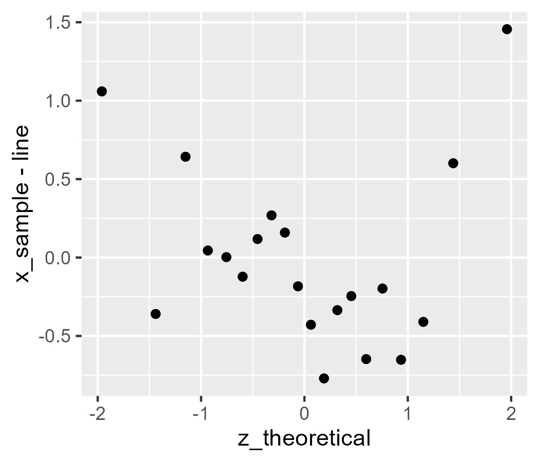
Let’s give it a try:
ggplot(d) +
  stat_worm(aes(sample = x_sample), robust = FALSE) +
  # test against above code
  geom_point(aes(x = z_theoretical, y = x_sample - line))
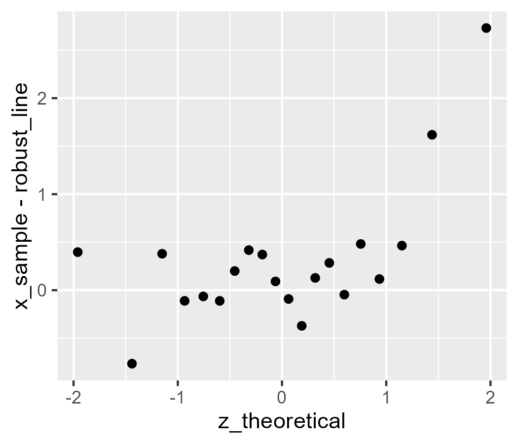
d$robust_line <-
  median(d$x_sample) + d$z_theoretical * IQR(d$x_sample) / 1.349

ggplot(d) +
  stat_worm(aes(sample = x_sample), robust = TRUE) +
  # test against above code
  geom_point(aes(x = z_theoretical, y = x_sample - robust_line))
Now, we work through the same procedure with the confidence band. First, create the user-facing layer function that we want to use.
stat_worm_band <- function(
  mapping = NULL,
  data = NULL,
  geom = GeomRibbonHollow,
  position = "identity",
  ...,
  # important part
  robust = FALSE,
  band_width = .95,
  na.rm = FALSE,
  show.legend = NA,
  inherit.aes = TRUE
) {
  layer(
    data = data,
    mapping = mapping,
    # important part
    stat = StatWormBand,
    geom = geom,
    position = position,
    show.legend = show.legend,
    inherit.aes = inherit.aes,
    # important part
    params = list(
      robust = robust,
      band_width = band_width,
      na.rm = na.rm,
      ...
    ),
  )
}
The easiest way to draw two lines in a confidence band is with geom_ribbon(),
but geom_ribbon() by default draws a filled shape. It would fill the space
between the lines with solid black. (It was a pain while developing this code!)
Fortunately, the vignette gives an example of modifying an existing geom to take
new defaults. We follow that example and create a new GeomRibbonHollow:
GeomRibbonHollow <- ggproto(
  # Make this geom
  "GeomRibbonHollow",
  # inheriting from:
  GeomRibbon,
  # but changing this:
  default_aes = aes(
    colour = "black",
    fill = NA,
    size = 0.5,
    linetype = 1,
    alpha = NA)
  )
Next, we create StatWormBand. It’s the same kind of code as above in the post,
in this case written generically for a dataframe called data with a column
called sample.
StatWormBand <- ggproto(
  "StatWormBand",
  Stat,
  default_aes = aes(
    x = after_stat(theoretical),
  ),
  required_aes = c("sample"),
  compute_group = function(data, scales, robust = FALSE, band_width = .95) {
    sample <- sort(data$sample)
    n <- length(sample)
    quantiles <- ppoints(n)

    if (robust) {
      mean <- median(sample)
      sd <- IQR(sample) / 1.349
    } else {
      mean <- mean(sample)
      sd <- sd(sample)
    }

    theoretical <- qnorm(quantiles)
    # at least 80 points for the curves
    steps <- if (n < 80) 80 else n
    z_range <- seq(min(theoretical), max(theoretical), length.out = steps)
    scaled_theoretical <- z_range * sd + mean

    # i.e., convert .95 to .025 and .975 and convert those to z scores
    band_z <- qnorm((1 + c(-band_width, band_width)) / 2)

    se_z <- function(z, n) {
      sqrt(pnorm(z) * (1 - pnorm(z)) / n) / dnorm(z)
    }

    ymin <- band_z[1] * se_z(z_range, n) * sd
    ymax <- band_z[2] * se_z(z_range, n) * sd

    data.frame(
      quantile = quantiles,
      theoretical = z_range,
      scaled_theoretical = scaled_theoretical,
      ymin = ymin,
      ymax = ymax
    )
  }
)
Okay, moment of truth:
ggplot(d) +
  stat_worm(aes(sample = x_sample)) +
  # original version from above
  geom_ribbon(
    aes(x = z, ymax = upper - line, ymin = lower - line),
    data = band,
    fill = NA,
    color = "blue"
  ) +
  stat_worm_band(aes(sample = x_sample))
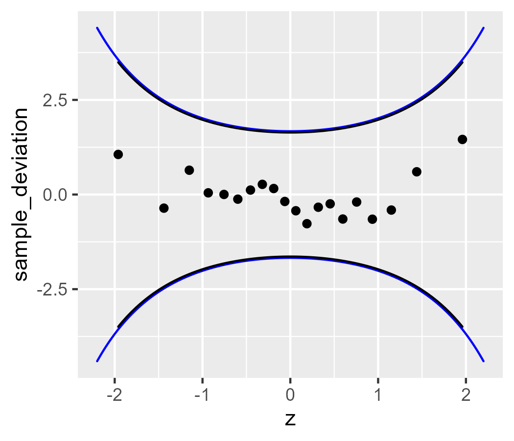
The bands differ slightly because stat_worm_band() uses 1.96 standard errors
for its confidence band (instead of 2) and because stat_worm_band() matches
the range of the data (our earlier example manually set the range).
Finally, let’s look at the robust version:
ggplot(d) +
  stat_worm(aes(sample = x_sample), robust = TRUE) +
  # for comparison
  geom_ribbon(
    aes(
      x = z,
      ymax = robust_upper - robust_line,
      ymin = robust_lower - robust_line
    ),
    data = band,
    fill = NA,
    color = "blue"
  ) +
  stat_worm_band(aes(sample = x_sample), robust = TRUE)
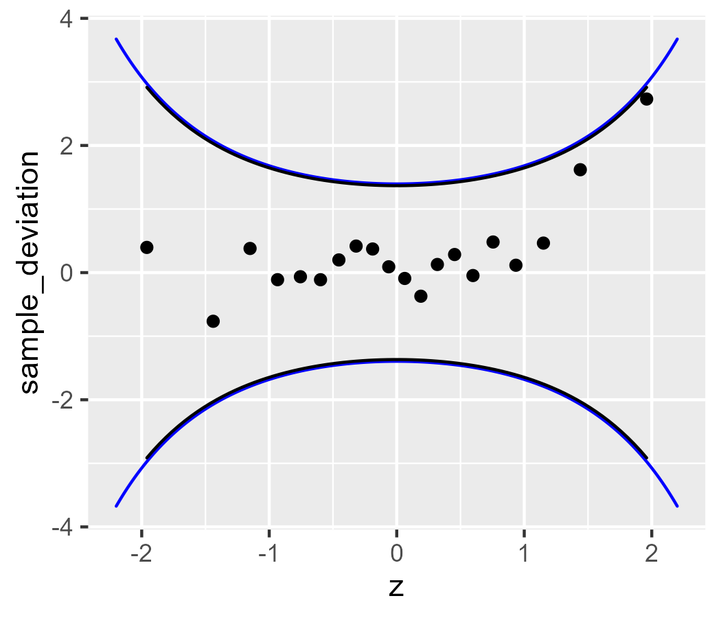
This implementation is a decent start. A more complete version would support
other reference distributions besides the normal distribution and allow some
calculations to be fixed. That is, with this version, if we facet the data or
color the lines, the statistics are calculated separately for each facet, color,
etc. (We compute the statistics with the compute_group() function, separately
for each aesthetic group.) Each group of data is a new dataset, not a
highlighted part of the original distribution. Plotting different subsets of
data in different colors but keeping them part of the same quantile
calculation would be useful for exploring which subsets of data are deviating
away from 0.
Bonus 2: A test run on some distributions
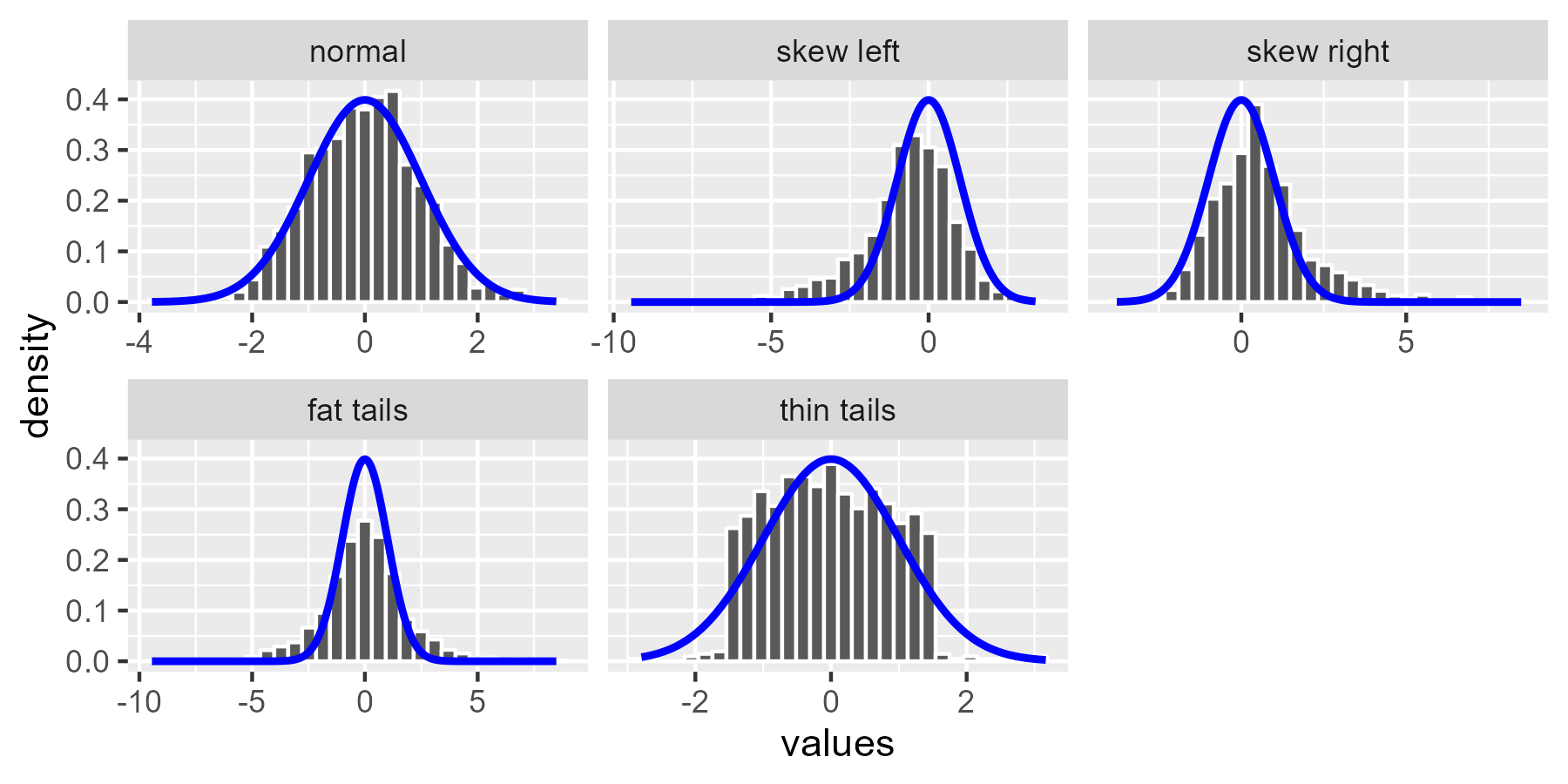
[Section added on 2020-08-27.] It’s time for the worm crawl through some dirt. We’ll use the simulated datasets from Sean Kross’s tutorial and look at how badly behaved distributions look for normal-distribution worm plots. First, let’s create the diagnostic examples.
set.seed(2-25-16)
n <- 1000
normal <- rnorm(n)

draws <- list(
  normal = normal,
  `skew left`  = c(normal[normal < 0] * 2.5, normal),
  `skew right` = c(normal[normal > 0] * 2.5, normal),
  `fat tails` = c(normal * 2.5, normal),
  # This will be different from the original post.
  # Wikipedia says the uniform () is ~*platykurtotic*~
  `thin tails` = c(rnorm(200), runif(800, -1.5, 1.5))
)

# create a list column then unnest() to get a tidy dataframe
df <- tibble::tibble(
  example = factor(names(draws), names(draws)),
  values = draws
)
df <- tidyr::unnest(df, values)

ggplot(df, aes(x = values)) +
  geom_histogram(
    aes(y = after_stat(density)),
    bins = 30,
    color = "white"
  ) +
  stat_function(fun = dnorm, color = "blue", size = 1, n = 200) +
  facet_wrap("example", scales = "free_x")
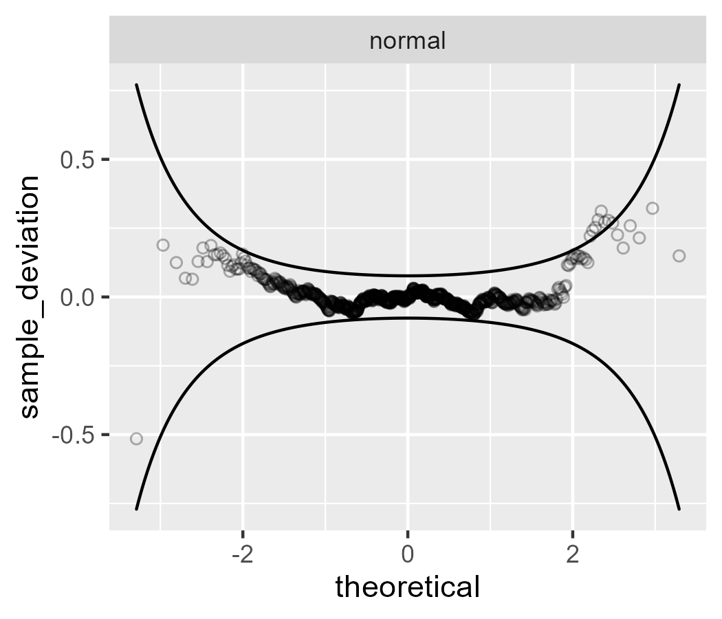
First, let’s start with a good worm plot. The points from a normal distribution almost all fall within the confidence band.
p <- ggplot(subset(df, example == "normal")) +
  aes(sample = values) +
  stat_worm(shape = 1, alpha = .3) +
  stat_worm_band() +
  facet_wrap("example", scales = "free")
p
For skewed data, the worm takes on a U shape.
# Use the `plot + list(data)` to replace the data in the plot
p +
  list(
    subset(df, example %in% c("skew left", "skew right"))
  )
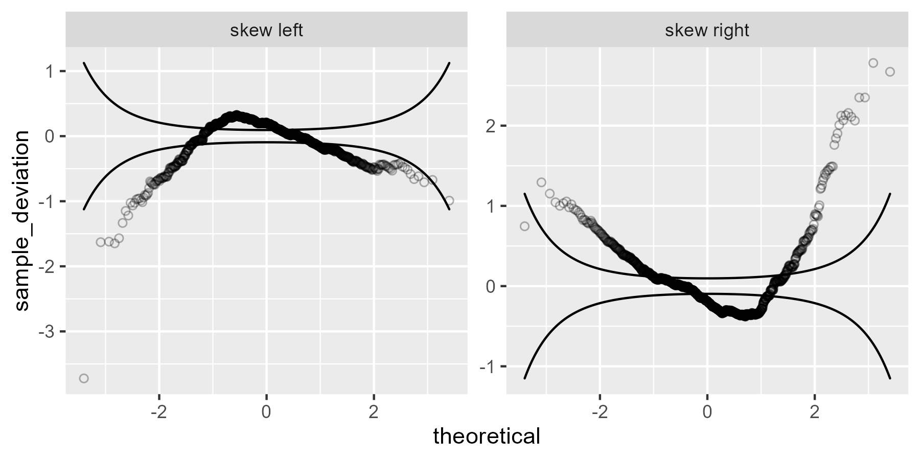
We can think through why we are seeing what we are seeing here. It’s not easy or obvious, but let’s go for it: Sample quantiles that are larger than expected (based on the theoretical distribution) will break through the ceiling (upper confidence line), and sample quantiles that are smaller than expected will break through the floor (lower confidence line). In the left skewed data, there is a long tail to the left, so the left values fall through the floor: The empirical 5th percentile is smaller than the 5th percentile from the theoretical distribution. The peak of the skewed data—see the histogram above—occurs to the left of the theoretical peak. That earlier peak means those values are larger than expected, so the worm breaks through the ceiling. Finally, the right tail is thinner for the left skewed data compared to the normal distribution, so again the empirical values fall through the floor.
The code below compares quantiles from the z-scores for the observed data and z-scores from the theoretical distribution, showing that the signs change as I just described.
# smaller than theoretical
quantile(scale(draws$`skew left`), .05, names = FALSE)
#> [1] -1.916239
qnorm(.05)
#> [1] -1.644854

# bigger than theoretical
quantile(scale(draws$`skew left`), .5, names = FALSE)
#> [1] 0.1376894
qnorm(.5)
#> [1] 0

# smaller than theoretical
quantile(scale(draws$`skew left`), .95, names = FALSE)
#> [1] 1.387601
qnorm(.95)
#> [1] 1.644854
The right skewed data would follow the same idea, but flipped.
The fat and thin tailed data show S shapes.
p +
  list(
    subset(df, example %in% c("fat tails", "thin tails"))
  )
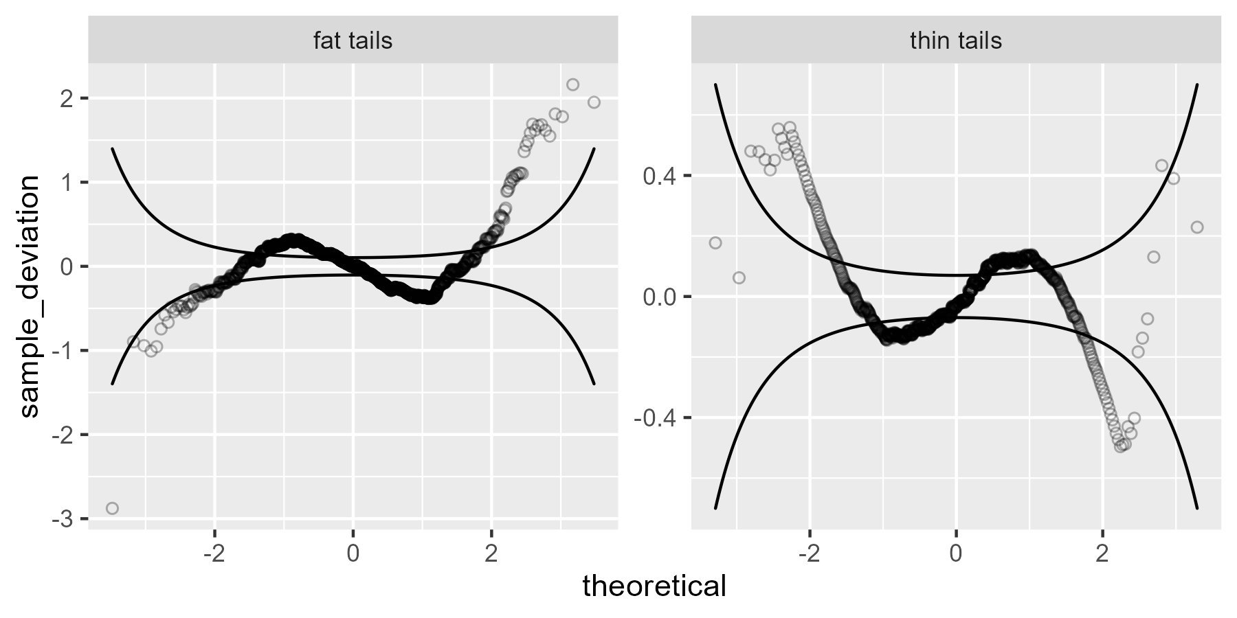
The fat-tailed data has values that are smaller than expected on the left tail
(falling through the floor) and larger than expected on the right tail (breaking
through the ceiling), so that explains tails of that worm plot. The middle bumps
are harder to figure out, but I think looking at the quantiles helps. (Note that
this plot shows that including those extra columns in StatWorm$compute_group()
has paid off because we can now access them with after_stat().)
ggplot(subset(df, example == "fat tails")) +
  aes(sample = values) +
  geom_line(
    aes(
      x = after_stat(sample),
      y = after_stat(quantile),
      color = "empirical"
    ),
    stat = StatWorm
  ) +
  geom_line(
    aes(
      x = after_stat(scaled_theoretical),
      y = after_stat(quantile),
      color = "normal"
    ),
    stat = StatWorm
  ) +
  labs(color = "Quantile source") +
  guides(color = guide_legend(nrow = 1)) +
  theme(legend.position = "top", legend.justification =  "left")
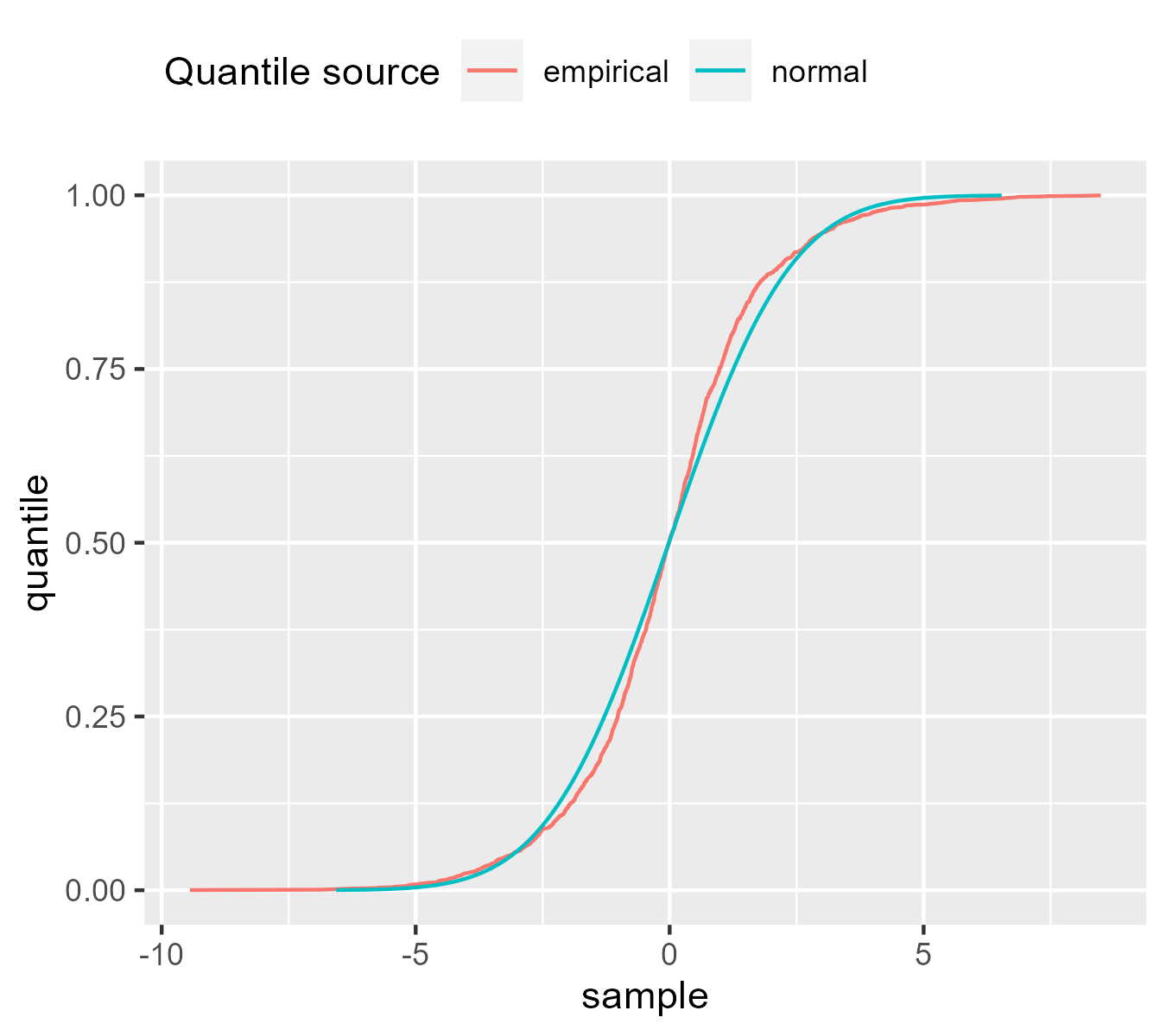
We can see how the lines switch places a few times. That the normal line is to right of the empirical line at y = .75 means that at that quantile, the normal distribution has larger values than the scaled empirical distribution. For the thin tailed data, the same reasoning applies but once again, it’s flipped.
Finally, I want to advertise that Table 2 in the worm plot paper summarizes these heuristics (like U-shaped and S-shaped worms) and includes other heuristics about the slope and intercept of the worm.
Last knitted on 2022-05-27. Source code on GitHub.2
-
Fox uses a funny phrase in a footnote as he notes that the approach produces “cumulative proportions of 0 or 1, which would be an embarrassment […] for distributions like the normal […]”. Definitely, not a good look. ↩
-
.session_info
#> ─ Session info ───────────────────────────────────────────────────────────────
#>  setting  value
#>  version  R version 4.2.0 (2022-04-22 ucrt)
#>  os       Windows 10 x64 (build 22000)
#>  system   x86_64, mingw32
#>  ui       RTerm
#>  language (EN)
#>  collate  English_United States.utf8
#>  ctype    English_United States.utf8
#>  tz       America/Chicago
#>  date     2022-05-27
#>  pandoc   NA
#>
#> ─ Packages ───────────────────────────────────────────────────────────────────
#>  package      * version date (UTC) lib source
#>  abind          1.4-5   2016-07-21 [1] CRAN (R 4.2.0)
#>  assertthat     0.2.1   2019-03-21 [1] CRAN (R 4.2.0)
#>  car            3.0-13  2022-05-02 [1] CRAN (R 4.2.0)
#>  carData        3.0-5   2022-01-06 [1] CRAN (R 4.2.0)
#>  cli            3.3.0   2022-04-25 [1] CRAN (R 4.2.0)
#>  colorspace     2.0-3   2022-02-21 [1] CRAN (R 4.2.0)
#>  crayon         1.5.1   2022-03-26 [1] CRAN (R 4.2.0)
#>  DBI            1.1.2   2021-12-20 [1] CRAN (R 4.2.0)
#>  digest         0.6.29  2021-12-01 [1] CRAN (R 4.2.0)
#>  dplyr          1.0.9   2022-04-28 [1] CRAN (R 4.2.0)
#>  ellipsis       0.3.2   2021-04-29 [1] CRAN (R 4.2.0)
#>  evaluate       0.15    2022-02-18 [1] CRAN (R 4.2.0)
#>  fansi          1.0.3   2022-03-24 [1] CRAN (R 4.2.0)
#>  farver         2.1.0   2021-02-28 [1] CRAN (R 4.2.0)
#>  gamlss         5.4-3   2022-04-24 [1] CRAN (R 4.2.0)
#>  gamlss.data    6.0-2   2021-11-07 [1] CRAN (R 4.2.0)
#>  gamlss.dist    6.0-3   2022-03-08 [1] CRAN (R 4.2.0)
#>  generics       0.1.2   2022-01-31 [1] CRAN (R 4.2.0)
#>  ggplot2      * 3.3.6   2022-05-03 [1] CRAN (R 4.2.0)
#>  git2r          0.30.1  2022-03-16 [1] CRAN (R 4.2.0)
#>  glue           1.6.2   2022-02-24 [1] CRAN (R 4.2.0)
#>  gridGraphics   0.5-1   2020-12-13 [1] CRAN (R 4.2.0)
#>  gtable         0.3.0   2019-03-25 [1] CRAN (R 4.2.0)
#>  here           1.0.1   2020-12-13 [1] CRAN (R 4.2.0)
#>  highr          0.9     2021-04-16 [1] CRAN (R 4.2.0)
#>  knitr        * 1.39    2022-04-26 [1] CRAN (R 4.2.0)
#>  labeling       0.4.2   2020-10-20 [1] CRAN (R 4.2.0)
#>  lattice        0.20-45 2021-09-22 [2] CRAN (R 4.2.0)
#>  lifecycle      1.0.1   2021-09-24 [1] CRAN (R 4.2.0)
#>  magrittr       2.0.3   2022-03-30 [1] CRAN (R 4.2.0)
#>  MASS           7.3-56  2022-03-23 [2] CRAN (R 4.2.0)
#>  Matrix         1.4-1   2022-03-23 [2] CRAN (R 4.2.0)
#>  munsell        0.5.0   2018-06-12 [1] CRAN (R 4.2.0)
#>  nlme           3.1-157 2022-03-25 [2] CRAN (R 4.2.0)
#>  patchwork    * 1.1.1   2020-12-17 [1] CRAN (R 4.2.0)
#>  pillar         1.7.0   2022-02-01 [1] CRAN (R 4.2.0)
#>  pkgconfig      2.0.3   2019-09-22 [1] CRAN (R 4.2.0)
#>  purrr          0.3.4   2020-04-17 [1] CRAN (R 4.2.0)
#>  R6             2.5.1   2021-08-19 [1] CRAN (R 4.2.0)
#>  ragg           1.2.2   2022-02-21 [1] CRAN (R 4.2.0)
#>  rlang          1.0.2   2022-03-04 [1] CRAN (R 4.2.0)
#>  rprojroot      2.0.3   2022-04-02 [1] CRAN (R 4.2.0)
#>  rstudioapi     0.13    2020-11-12 [1] CRAN (R 4.2.0)
#>  scales         1.2.0   2022-04-13 [1] CRAN (R 4.2.0)
#>  sessioninfo    1.2.2   2021-12-06 [1] CRAN (R 4.2.0)
#>  stringi        1.7.6   2021-11-29 [1] CRAN (R 4.2.0)
#>  stringr        1.4.0   2019-02-10 [1] CRAN (R 4.2.0)
#>  survival       3.3-1   2022-03-03 [2] CRAN (R 4.2.0)
#>  systemfonts    1.0.4   2022-02-11 [1] CRAN (R 4.2.0)
#>  textshaping    0.3.6   2021-10-13 [1] CRAN (R 4.2.0)
#>  tibble       * 3.1.7   2022-05-03 [1] CRAN (R 4.2.0)
#>  tidyr          1.2.0   2022-02-01 [1] CRAN (R 4.2.0)
#>  tidyselect     1.1.2   2022-02-21 [1] CRAN (R 4.2.0)
#>  utf8           1.2.2   2021-07-24 [1] CRAN (R 4.2.0)
#>  vctrs          0.4.1   2022-04-13 [1] CRAN (R 4.2.0)
#>  withr          2.5.0   2022-03-03 [1] CRAN (R 4.2.0)
#>  xfun           0.31    2022-05-10 [1] CRAN (R 4.2.0)
#>
#>  [1] C:/Users/Tristan/AppData/Local/R/win-library/4.2
#>  [2] C:/Program Files/R/R-4.2.0/library
#>
#> ──────────────────────────────────────────────────────────────────────────────

Leave a comment