Visualizing ordinal model probabilities with ribbons
Here is a ggplot2 recipe for plotting cumulative probabilities from ordinal regression models.
We have rating scores of various wines (1–5 point scale), and during the
production, temperature (temp) and skin contact were experimentally
controlled.
library(tidyverse)
library(ordinal)
wine <- as_tibble(wine)
wine
#> # A tibble: 72 × 6
#>    response rating temp  contact bottle judge
#>       <dbl> <ord>  <fct> <fct>   <fct>  <fct>
#>  1       36 2      cold  no      1      1
#>  2       48 3      cold  no      2      1
#>  3       47 3      cold  yes     3      1
#>  4       67 4      cold  yes     4      1
#>  5       77 4      warm  no      5      1
#>  6       60 4      warm  no      6      1
#>  7       83 5      warm  yes     7      1
#>  8       90 5      warm  yes     8      1
#>  9       17 1      cold  no      1      2
#> 10       22 2      cold  no      2      2
#> # ℹ 62 more rows

model <- clm(rating ~ temp * contact, data = wine)
pred_grid <- wine |>
  distinct(contact, temp)
predict.clm(type = "cum.prob") predictions provide two sets of
cumulative probabilities P(rating) ≤ ratingk and
P(rating) < ratingk. The first set yields a probability
of 1 for the highest rating, and the second set have probability 0 for
the first rating.
pred_grid |>
  predict(model, newdata = _, type = "cum.prob")
#> $cprob1
#>             1          2         3         4 5
#> 1 0.196035088 0.75833150 0.9669806 0.9929102 1
#> 2 0.059595928 0.44919920 0.8838723 0.9732608 1
#> 3 0.023374759 0.23547849 0.7419059 0.9321882 1
#> 4 0.004323076 0.05291811 0.3427392 0.7137748 1
#>
#> $cprob2
#>   1           2          3         4         5
#> 1 0 0.196035088 0.75833150 0.9669806 0.9929102
#> 2 0 0.059595928 0.44919920 0.8838723 0.9732608
#> 3 0 0.023374759 0.23547849 0.7419059 0.9321882
#> 4 0 0.004323076 0.05291811 0.3427392 0.7137748
Each rating’s probability is the difference between these two sets of cumulative probabilities, so ultimately we will visualize them directly as a ribbon between the two cumulative probabilities.
Get a long dataframe of probabilities.
preds <- pred_grid |>
  predict(model, newdata = _, type = "cum.prob") |>
  lapply(as.data.frame) |>
  bind_rows(.id = "prob_type") |>
  cbind(pred_grid, x = _) |>
  rename_with(stringr::str_remove, pattern = "x[.]") |>
  tidyr::pivot_longer(
    cols = c(-prob_type, -temp, -contact),
    names_to = "rating",
    values_to = "prob"
  ) |>
  tidyr::pivot_wider(
    names_from = prob_type,
    values_from = prob
  ) |>
  rename(prob_lte = cprob1, prob_lt = cprob2)
preds
#> # A tibble: 20 × 5
#>    contact temp  rating prob_lte prob_lt
#>    <fct>   <fct> <chr>     <dbl>   <dbl>
#>  1 no      cold  1       0.196   0
#>  2 no      cold  2       0.758   0.196
#>  3 no      cold  3       0.967   0.758
#>  4 no      cold  4       0.993   0.967
#>  5 no      cold  5       1       0.993
#>  6 yes     cold  1       0.0596  0
#>  7 yes     cold  2       0.449   0.0596
#>  8 yes     cold  3       0.884   0.449
#>  9 yes     cold  4       0.973   0.884
#> 10 yes     cold  5       1       0.973
#> 11 no      warm  1       0.0234  0
#> 12 no      warm  2       0.235   0.0234
#> 13 no      warm  3       0.742   0.235
#> 14 no      warm  4       0.932   0.742
#> 15 no      warm  5       1       0.932
#> 16 yes     warm  1       0.00432 0
#> 17 yes     warm  2       0.0529  0.00432
#> 18 yes     warm  3       0.343   0.0529
#> 19 yes     warm  4       0.714   0.343
#> 20 yes     warm  5       1       0.714
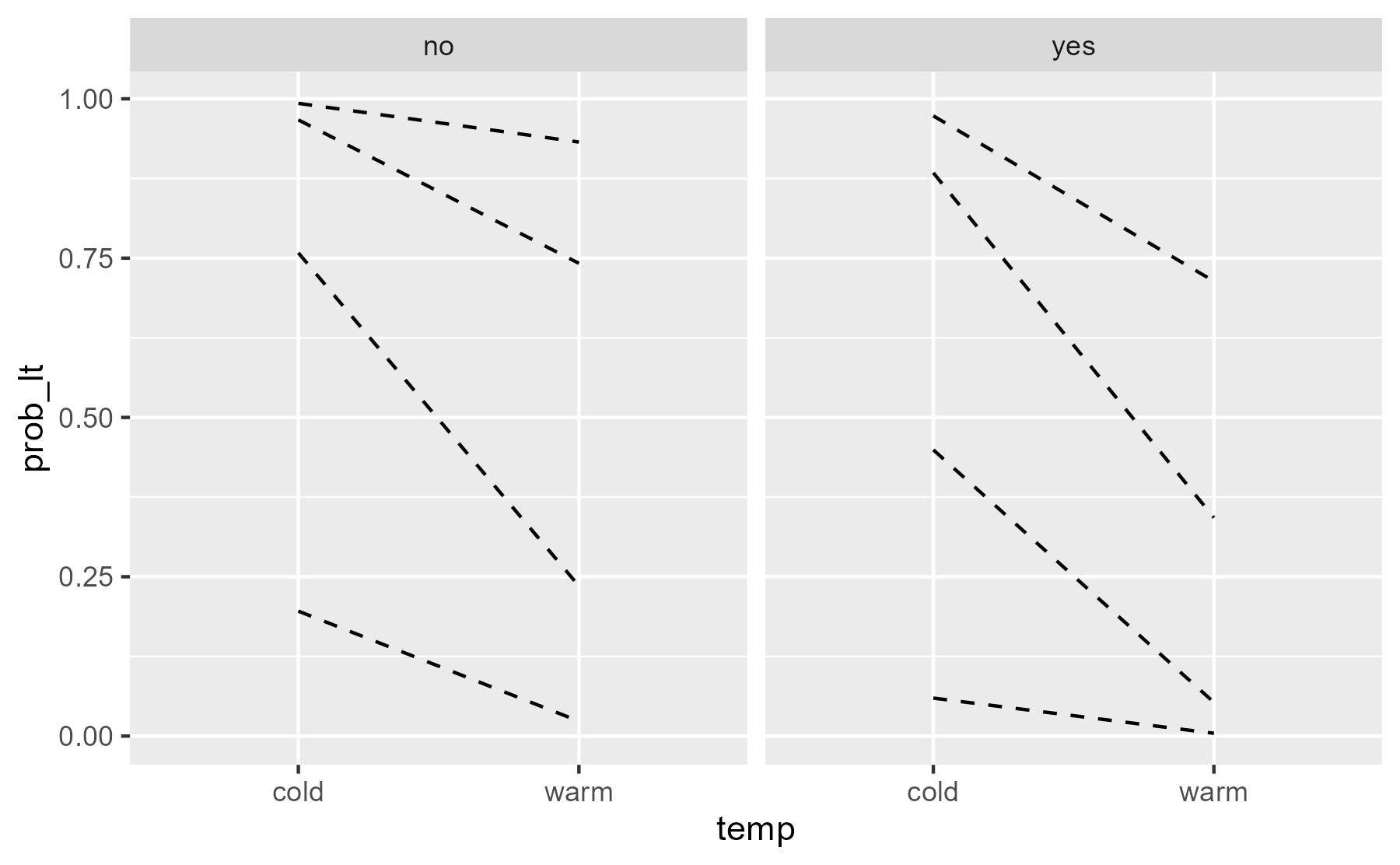
The less-than probabilities (prob_lt) provide thresholds between
rating levels.
ggplot(preds) +
  aes(x = temp) +
  geom_line(
    aes(group = rating, y = prob_lt),
    # don't draw solid line at y = 0
    data = function(x) filter(x, prob_lt != 0),
    linetype = "dashed"
  ) +
  facet_wrap("contact")
center
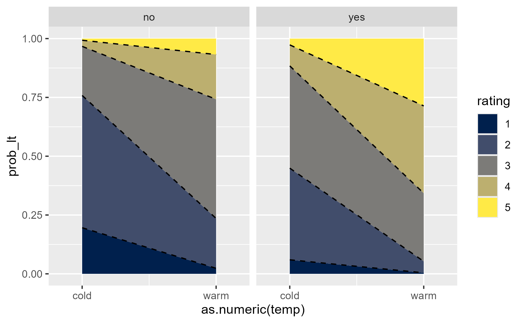
Next, we might fill in the areas. geom_ribbon() only likes continuous
x axes, so we note:
preds$temp_num <- as.numeric(preds$temp)
preds |> distinct(temp_num, temp)
#> # A tibble: 2 × 2
#>   temp_num temp
#>      <dbl> <fct>
#> 1        1 cold
#> 2        2 warm
Here the two columns of cumulative probabilities pay off because one provides the bottom of the ribbon and the other provides the top of the ribbon.
ggplot(preds) +
  aes(x = as.numeric(temp)) +
  geom_ribbon(
    aes(
      fill = rating, ymin = prob_lt, ymax = prob_lte
    )
  ) +
  geom_line(
    aes(group = rating, y = prob_lt),
    # don't draw solid line at y = 0
    data = function(x) filter(x, prob_lt != 0),
    linetype = "dashed"
  ) +
  facet_wrap("contact") +
  scale_x_continuous(
    breaks = 1:2, labels = c("cold", "warm"),
    expand = expansion(mult = .25)
  ) +
  scale_color_viridis_d(option = "E", aesthetics = "fill")
center
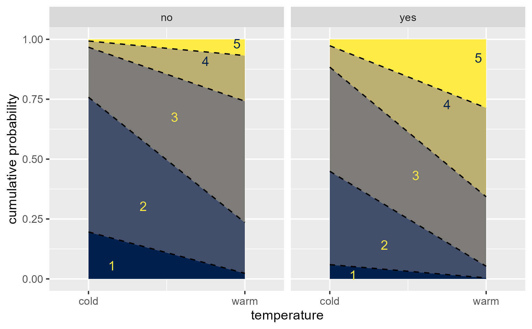
last_plot() +
  stat_summary(
    aes(
      x = 1 + as.numeric(rating) / 5 - .05,
      label = rating,
      color = rating,
      y = (prob_lte + prob_lt) / 2
    ),
    fun = median,
    geom = "text"
  ) +
  scale_color_manual(
    values = scales::viridis_pal(option = "E")(2)[c(2,2,2,1,1)]
  ) +
  guides(color = "none", fill = "none") +
  labs(x = "temperature", y = "cumulative probability")
center
Bayesian version
I once prepared a Bayesian version of the idea. Here is that recipe:
b_model <- brms::brm(
  rating ~ temp * contact,
  data = wine,
  family = brms::cumulative(),
  backend = "cmdstanr",
  chains = 1,
  file = "_caches/2022-03-07-ordinal"
)
Predictions comes as .category probabilities, so we sum them to
compute two cumulative probabilities. But we also compute posterior
medians to get the thresholds.
data_rvars <- pred_grid |>
  tidybayes::add_epred_draws(b_model) |>
  tidybayes::nest_rvars() |>
  group_by(contact, temp, .row) |>
  mutate(
    prob_lte = cumsum(.epred),
    # subtracting 1 from 1 to make a 0 rvar
    prob_lt = c(prob_lte[5] - 1, prob_lte[1:4])
  )
#> Loading required namespace: rstan

data_boundaries <- data_rvars |>
  group_by(contact, temp, .category) |>
  ggdist::median_qi(prob_lte, prob_lt)
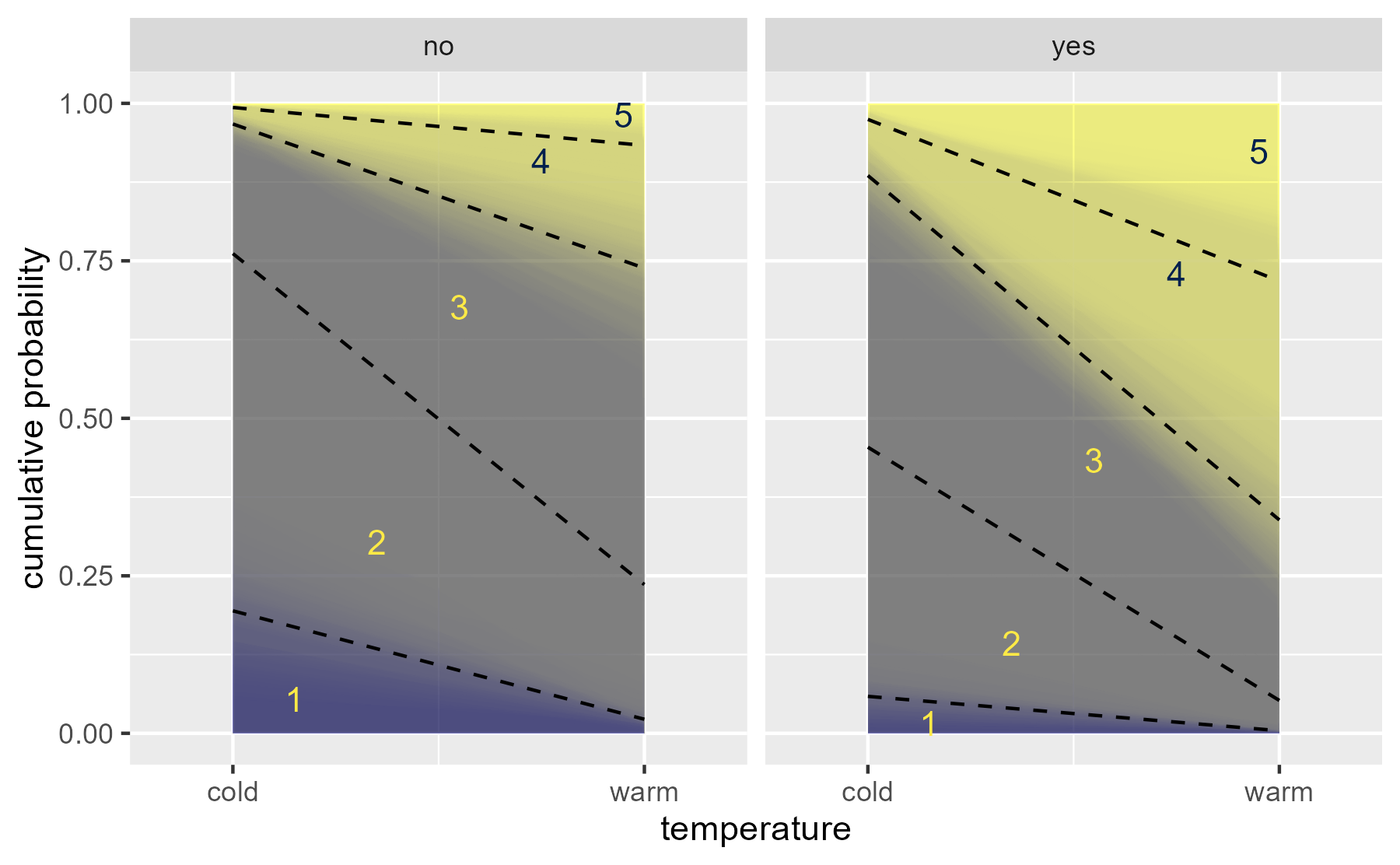
Here is the trick. Hint at the uncertainty by overlaying 100 ribbons:
data_draws_100 <- data_rvars |>
  tidybayes::unnest_rvars() |>
  filter(.draw <= 100)

# create 100 geom_area() layers
layers <- data_draws_100 |>
  split(~ .draw) |>
  lapply(function(x) {
    geom_ribbon(
      aes(fill = .category, ymin = prob_lt, ymax = prob_lte),
      alpha = .01,
      data = x
    )
  })

ggplot(data_draws_100) +
  aes(x = as.numeric(temp)) +
  layers +
  geom_line(
    aes(y = prob_lte, group = .category),
    data = data_boundaries |> filter(.category != 5),
    linetype = "dashed"
  ) +
  stat_summary(
    aes(
      x = 1 + as.numeric(.category) / 5 - .05,
      label = .category,
      color = .category,
      y = (prob_lte + prob_lt) / 2
    ),
    data = data_boundaries,
    fun = median,
    geom = "text"
  ) +
  facet_wrap("contact") +
  scale_x_continuous(
    breaks = 1:2, labels = c("cold", "warm"),
    expand = expansion(mult = .25)
  ) +
  scale_color_viridis_d(option = "E", aesthetics = "fill") +
  scale_color_manual(
    values = scales::viridis_pal(option = "E")(2)[c(2,2,2,1,1)]
  ) +
  guides(color = "none", fill = "none") +
  labs(x = "temperature", y = "cumulative probability")
center
Leave a comment